We were hired to develop the graphic design for the 60th anniversary book of the Clube Alto dos Pinheiros, in São Paulo. To do this, we participated in meetings with board members and associates, where we could understand the importance of the club’s architecture and the significance of its historical value. The rebranding of the logo and its new positioning, with the slogan “decidedly off,” helped establish the initial guidelines for the project.
However, it was during a visit to the club that the central idea for the visual concept emerged. The entrance, austere and minimalist, made of concrete, imposes the strength of brutalist architecture. However, once you pass through it, the environment completely transforms: a spacious, green, and welcoming space. This synesthetic experience—the transition from the rigidity of the structure to the fluidity and organic nature of the internal space—served as the inspiration for the entire visual identity of the project.
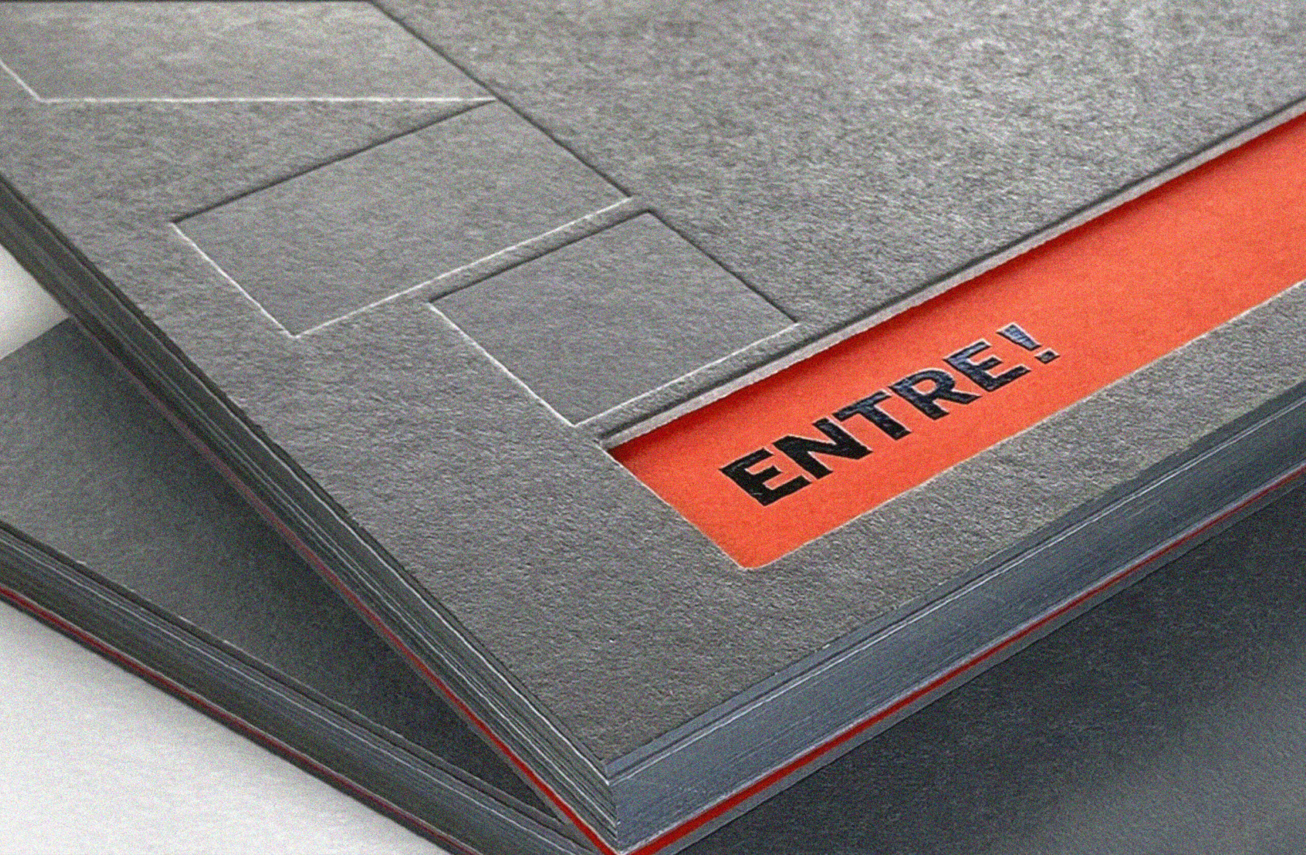
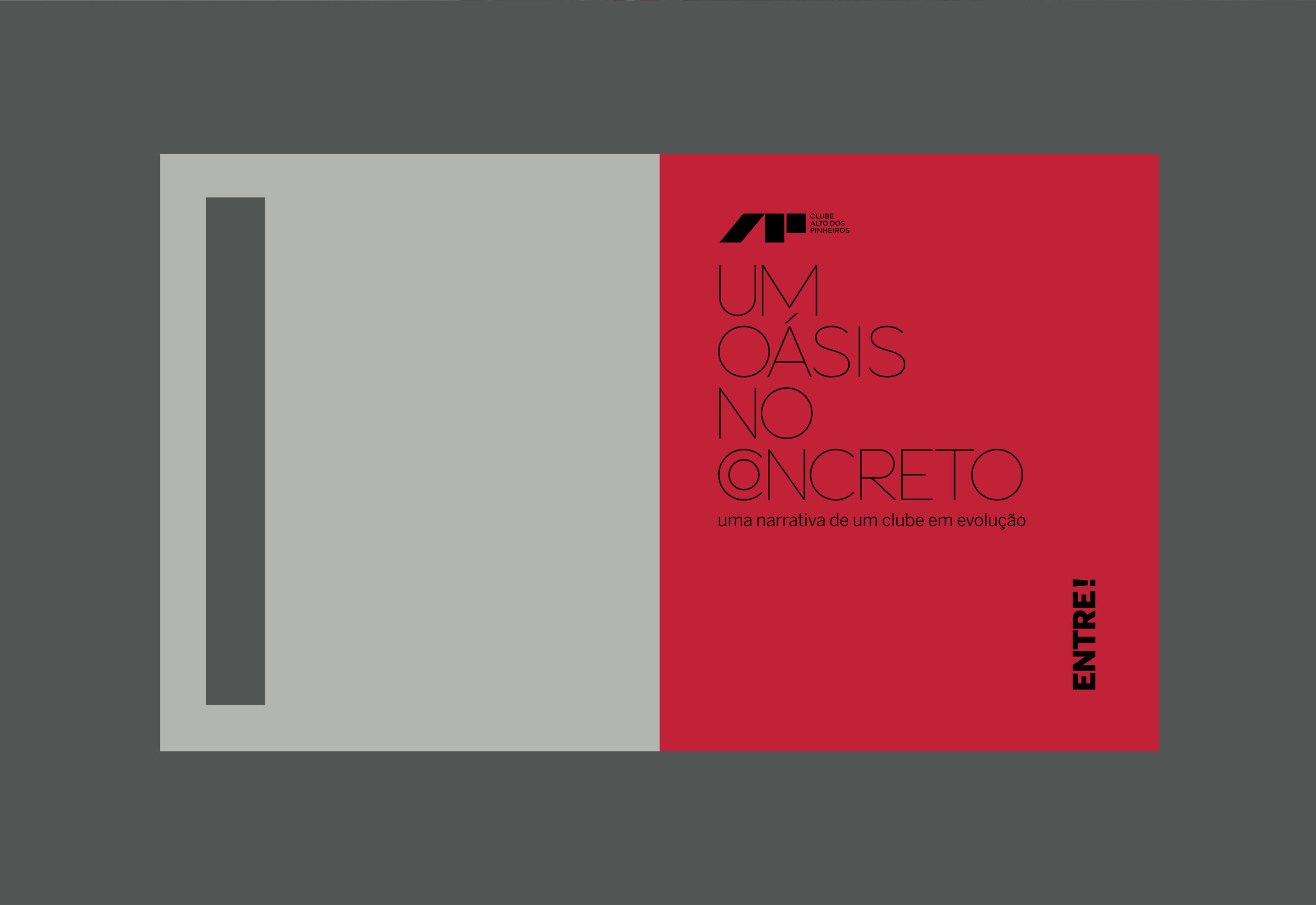
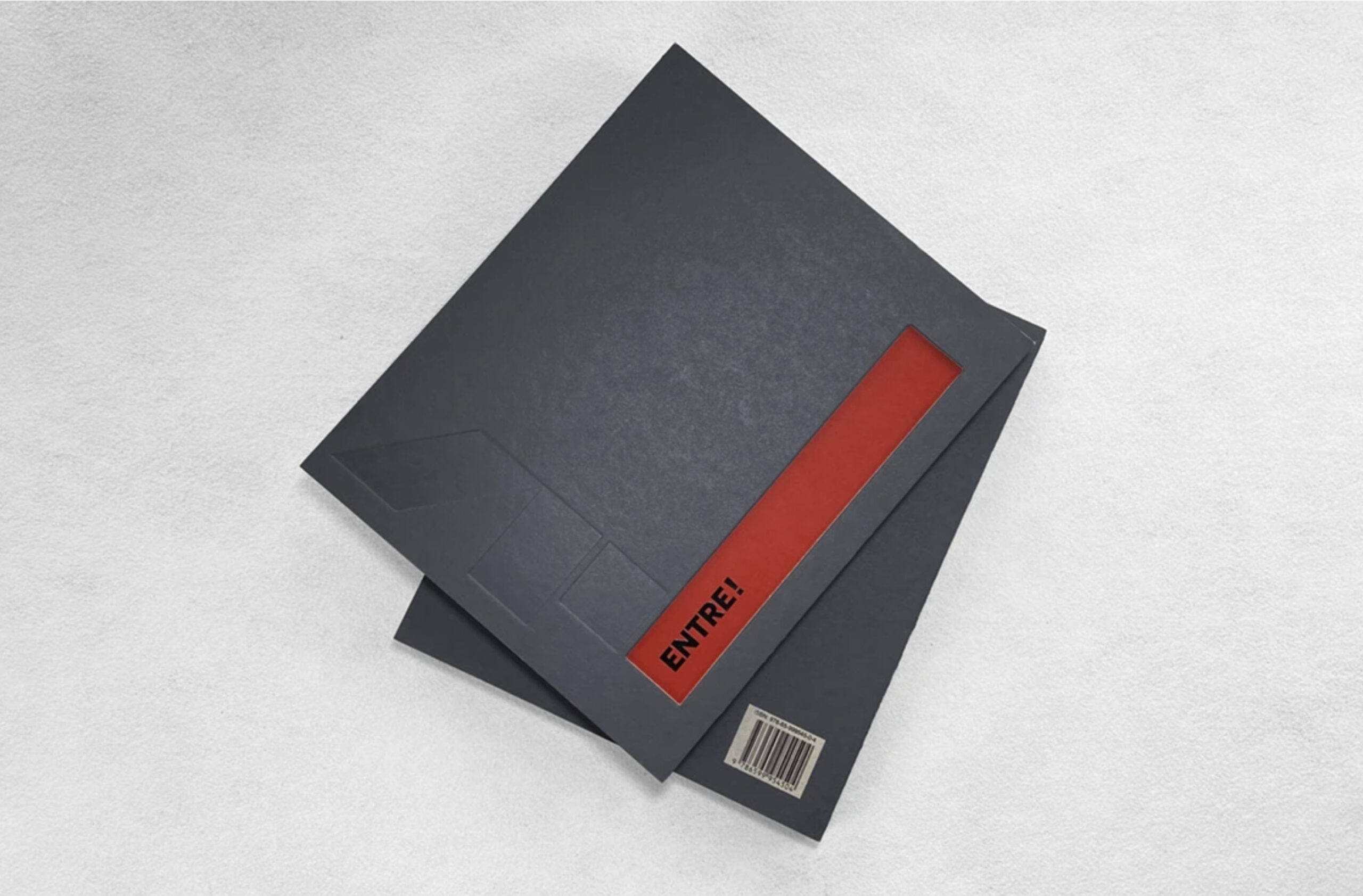
The cover of the book reflects this sensation: made of gray cardboard, reminiscent of concrete, it features a cutout that invites the reader to enter, symbolizing this striking transition between the solidity of brutalist architecture and the lightness of the interior space.
With exquisite graphic production by Estúdio Miolo, texts by Prima Pagina, and the generosity of the associates in sharing their memories, the book became an example of how co-creation can lead to surprising results.