
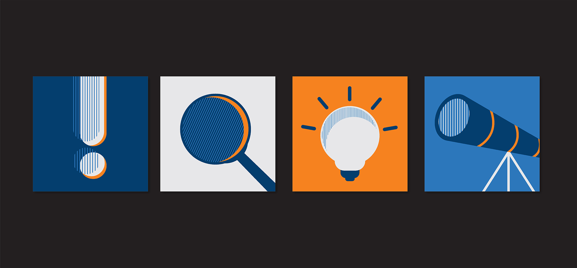
We believe that collaboration leads to the best results. Co-creation is our process: we capture your ideas, shape your visions, and build something unique together. Let’s make your idea happen!
We offer a variety of creative solutions with a collaborative approach, tailored to the specific needs of each project.
Graphic design and layout for books, magazines, catalogs, and annual reports
Architecture development, graphic design, and website development for various needs
Based on your needs, we assemble teams with the necessary skills to provide various services and products.
Brand conceptualization, logo design, Visual Identity systems, Application Manual, and brand tone of voice
Graphic design and layout for books, magazines, catalogs, and annual reports
Architecture development, graphic design, and website development for various needs
Graphic design and layout of animated or static presentations for PowerPoint, Google Slides, Canva, or Keynote
We start with a meeting to understand your needs and objectives, ensuring everything is aligned from the beginning.
We follow up and validate each part of the project with you, ensuring your expectations are met.
After gathering the information, we develop a clear plan outlining what we aim to achieve, always seeking your approval.
With the briefing approved, our team comes together to develop creative solutions in graphic design and branding, keeping you involved throughout the process.
We present our proposals and welcome your feedback, making the necessary adjustments to ensure the final result meets your expectations.
Once you approve the project, we deliver all materials ready for use.
We stay in touch after delivery, providing support and assessing the effectiveness of the implemented solutions.
I had the pleasure of working with Naru twice—first to create my initial visual identity and later to update it—and I couldn't be more satisfied with the results. Luciana and her team perfectly captured the concepts on both occasions, translating my vision into a brand even better than I could have imagined. It's evident how much love and care they put into everything they do, and I wholeheartedly recommend them!
Working with Naru is incredibly easy and rewarding. Besides having exceptional taste and extensive knowledge of market trends, Naru effortlessly translates our Brand Manual into the real needs of our materials. Their service is outstanding—fast, efficient, and truly excellent. I highly recommend them—lucky are those who get to be their clients!
Naru’s work combines creativity and attention to detail, ensuring that clients always have confidence in achieving excellent results. Their outstanding customer service is also a major highlight.
I have been working with digital and print publications for over 20 years. Rarely do I come across work as well-executed—especially as elegant—as Naru’s.
Naru is fast, easy to work with, simple, and original. We love their work, which is why we keep coming back!
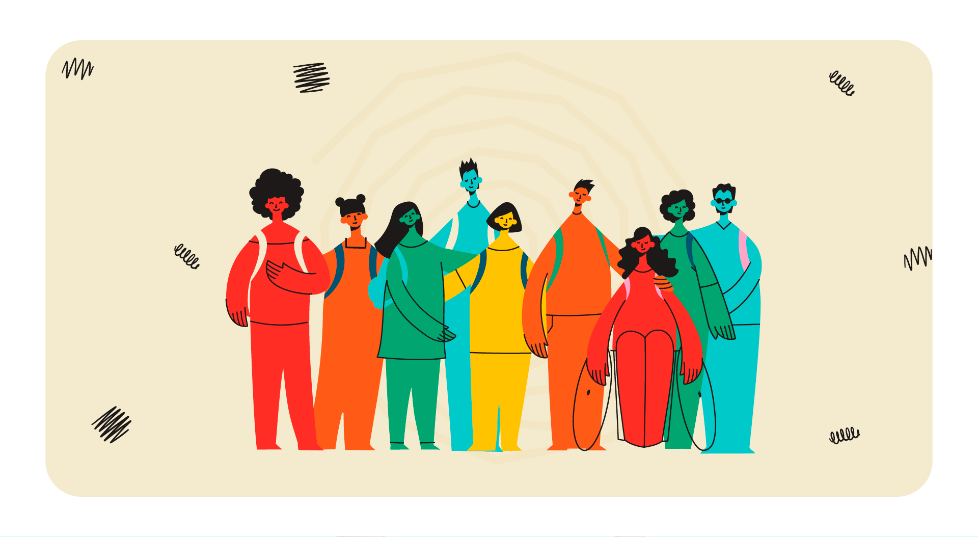
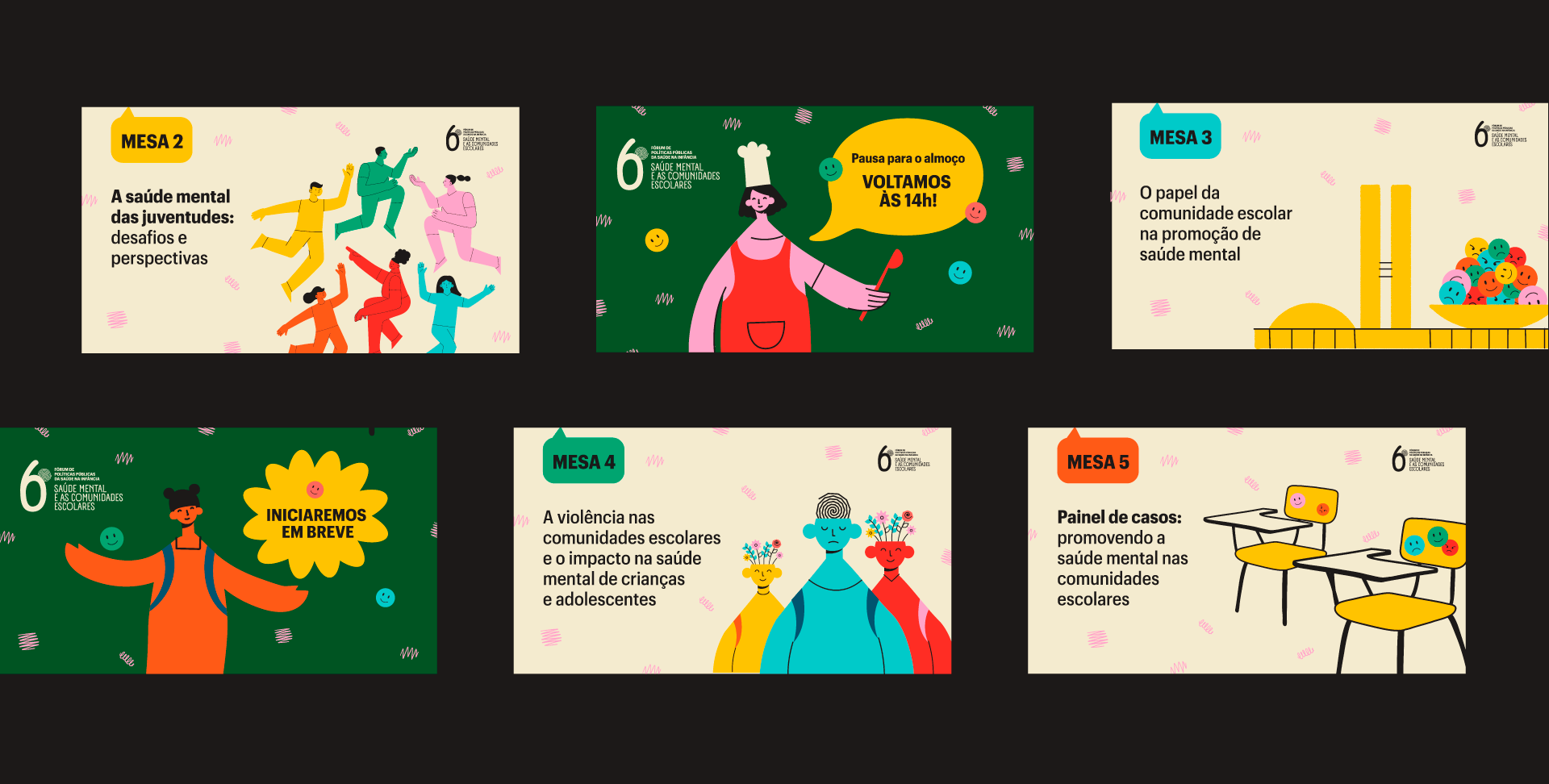
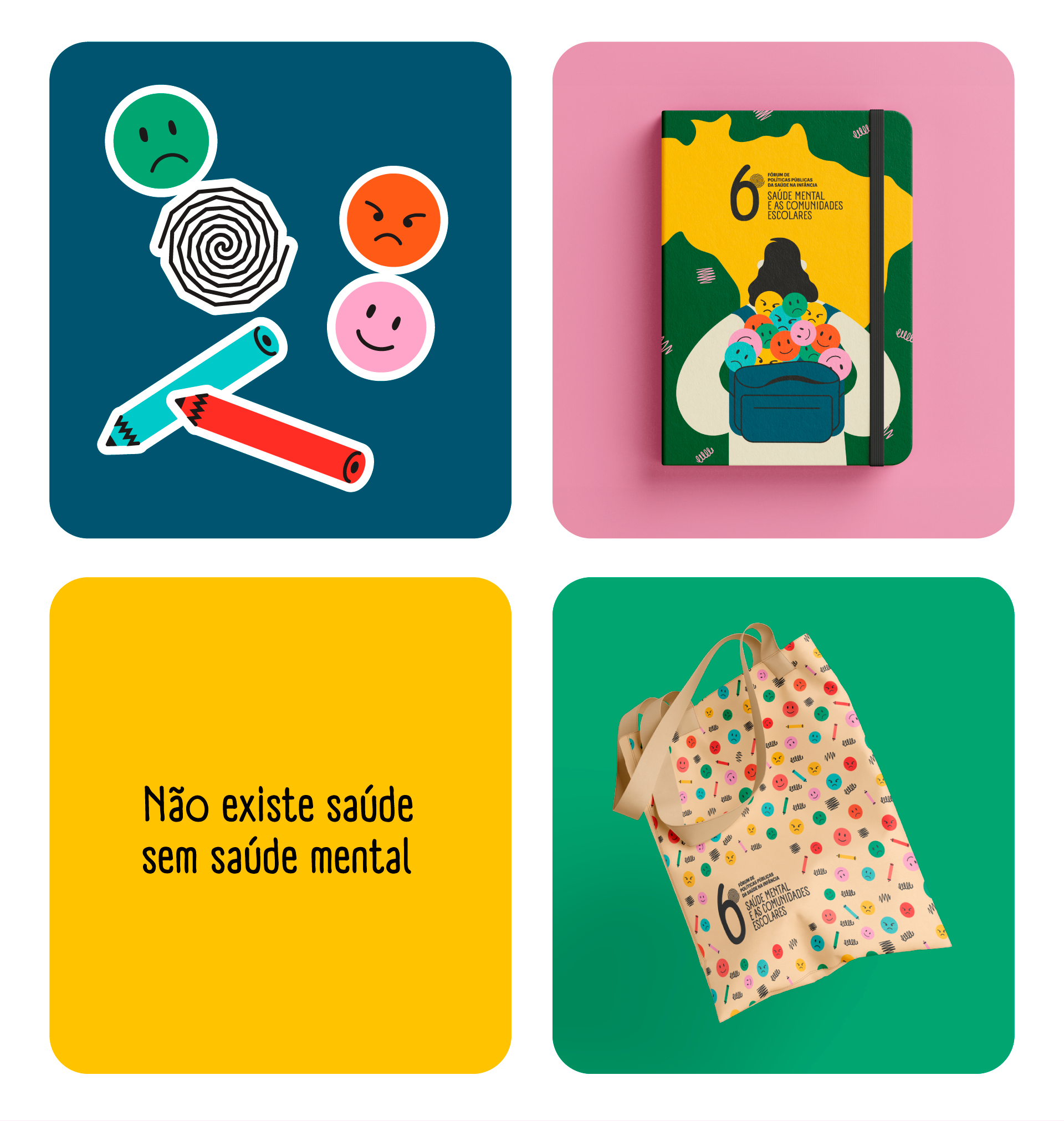
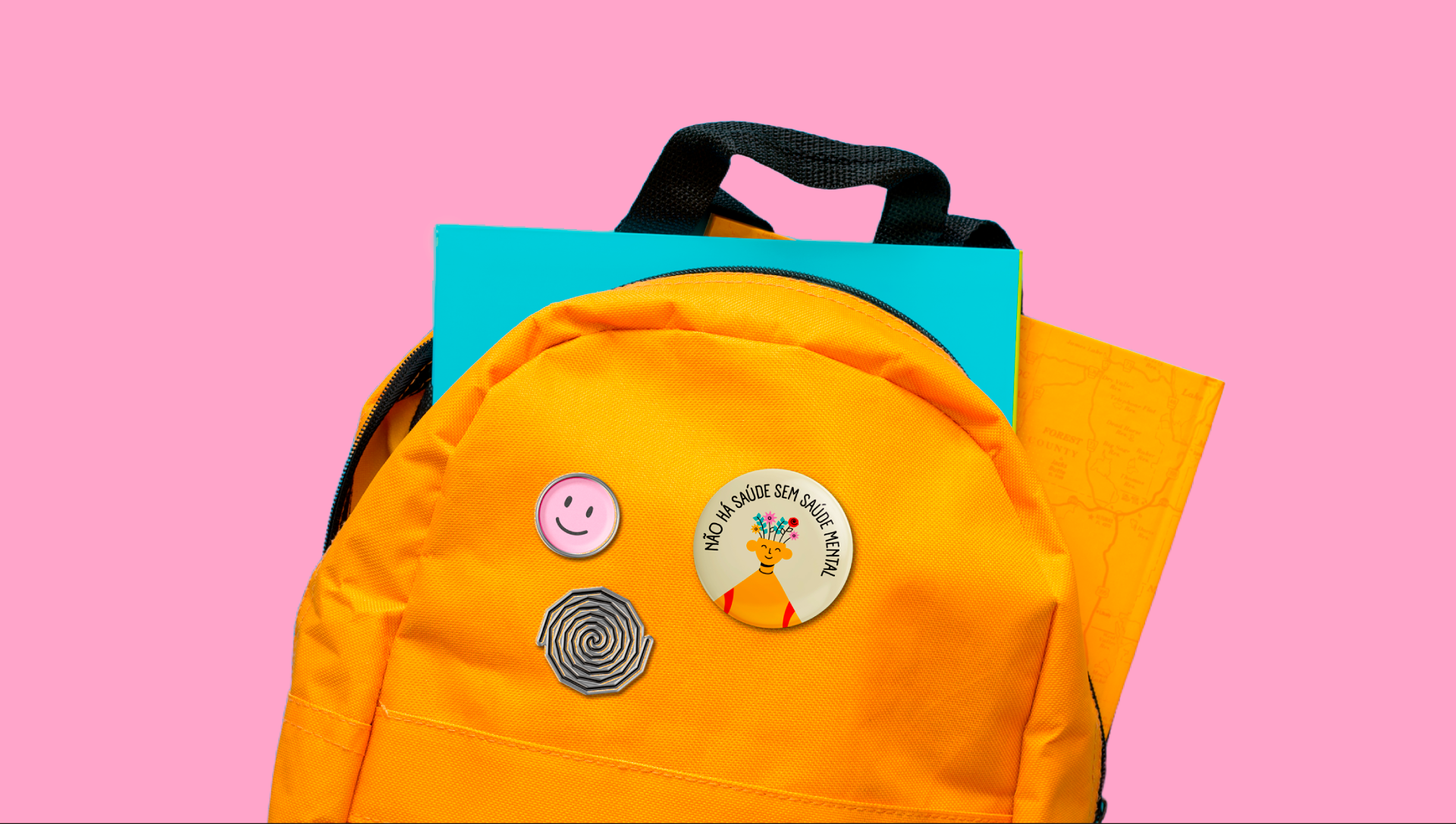
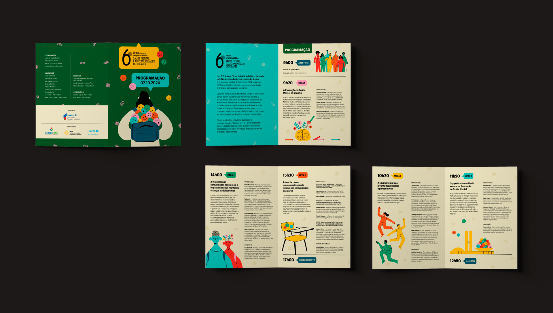
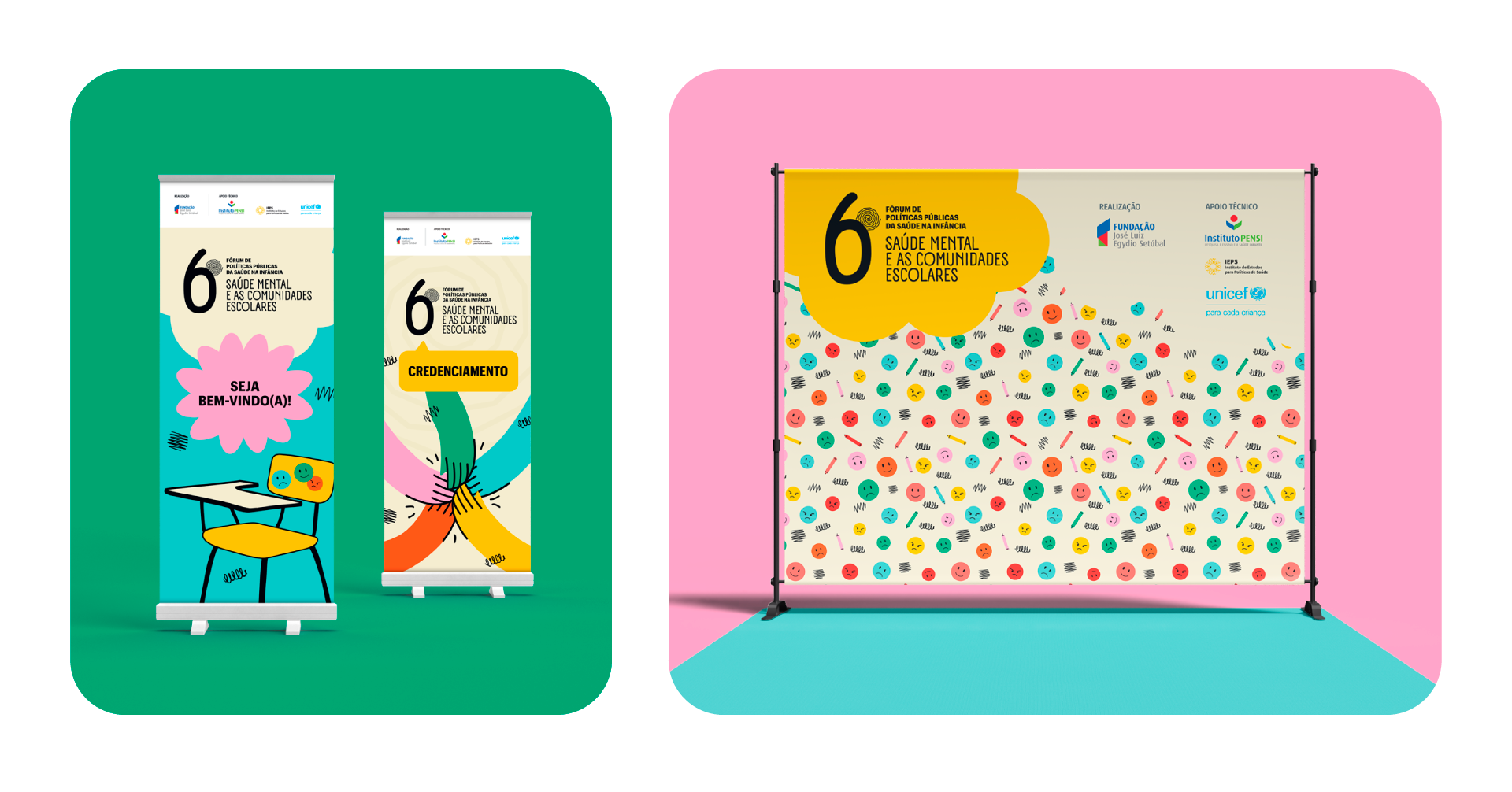
José Luiz Egydio Setúbal Foundation organizes the Annual Forum on Public Policies for Child Health. For the 6th Forum, with the theme “Mental Health and School Communities,” we had the opportunity to work closely with the Foundation’s Advocacy team to explore the topics in depth. The result of this dialogue was a visual identity rich in illustrations that connect with young people and encompass the entire school environment.
CLIENT: Fundação José Luiz Egydio Setúbal | YEAR: 2024
Visual Identity | Promotional Materials | Signage | Merchandise | Social Media


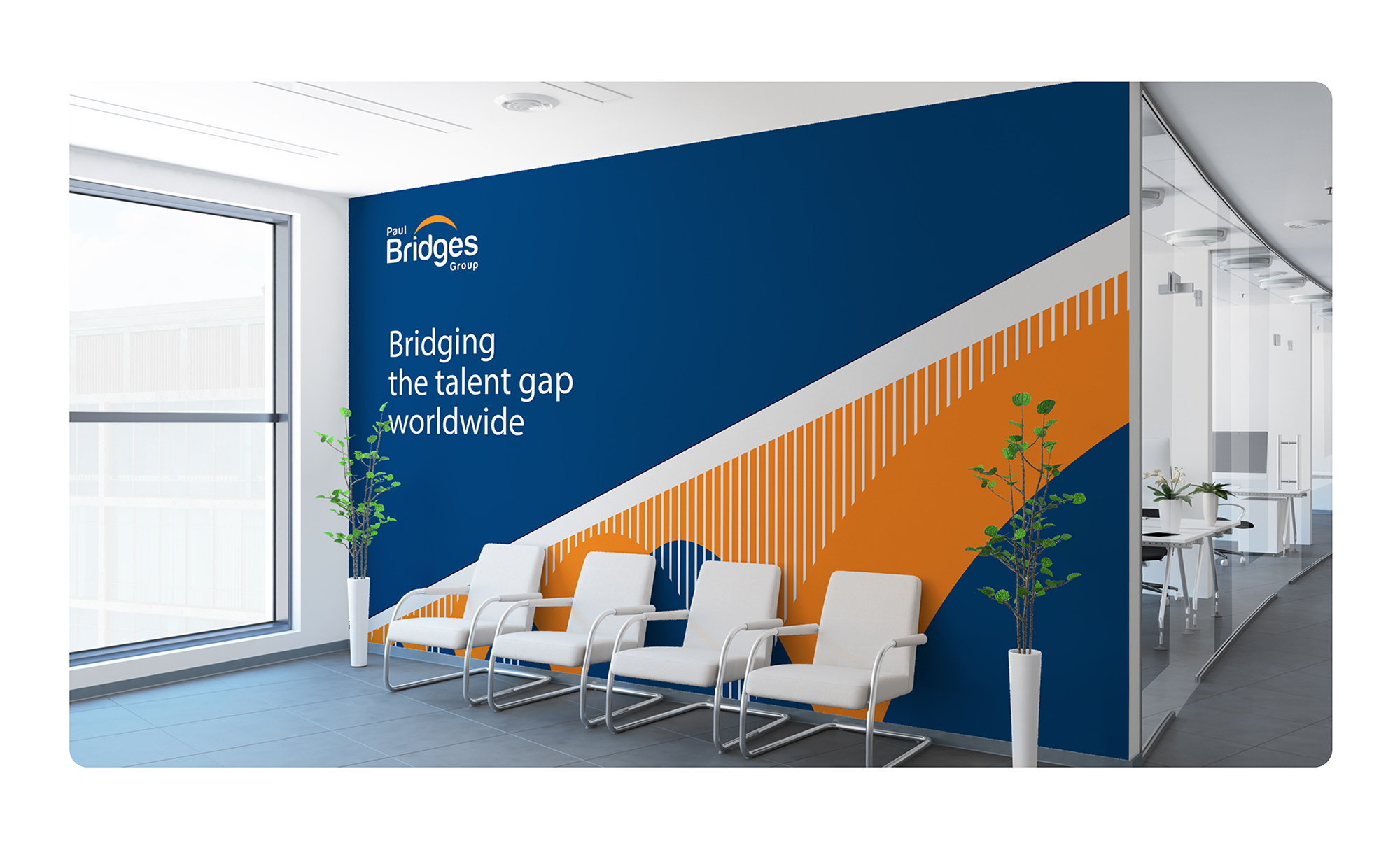
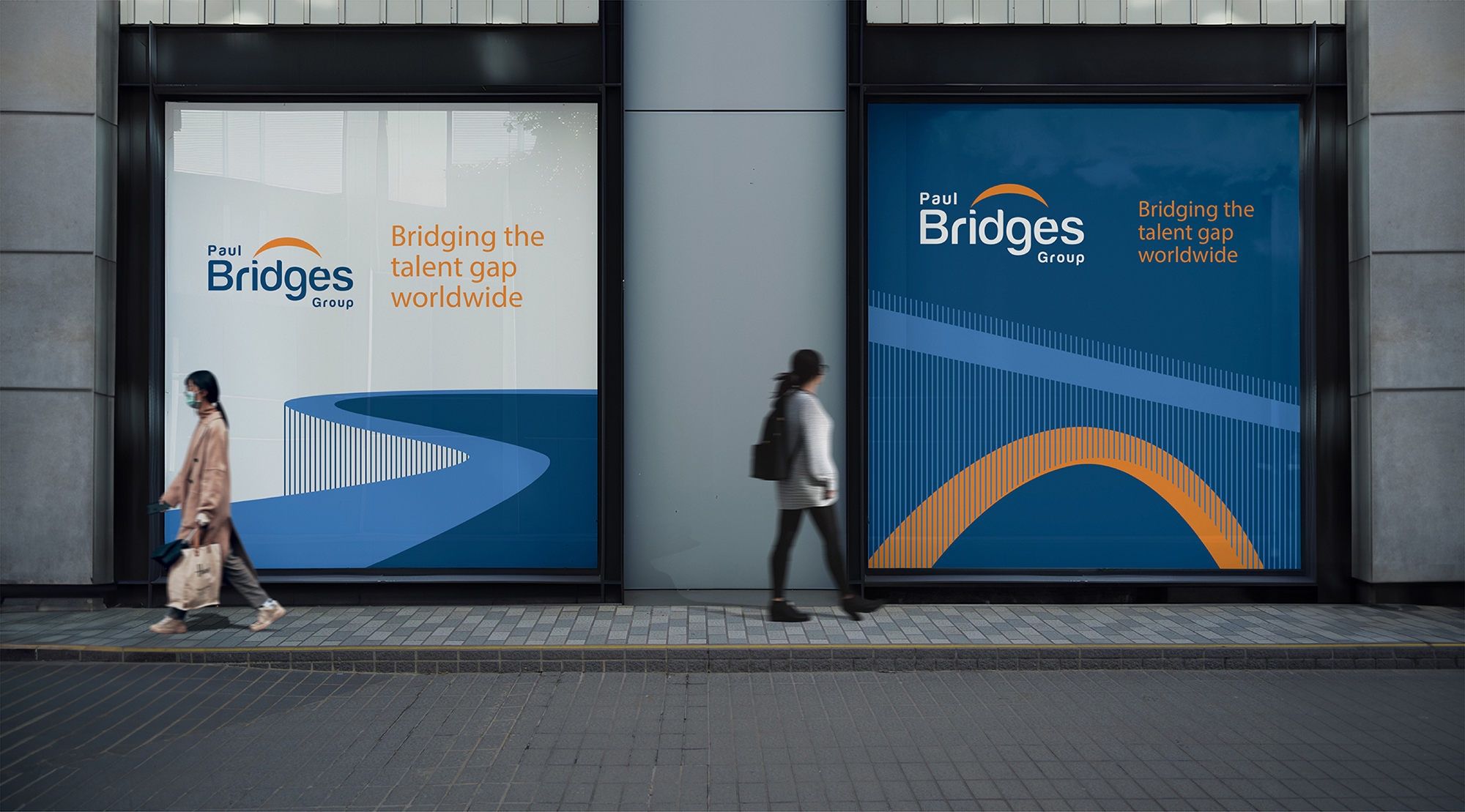
For Paul Bridges Group, a leading American company in connecting recruitment professionals and executive search, we created a Visual Identity that reflects its purpose: connecting talent to opportunities and opening pathways.
We redesigned the brand to improve its legibility, adjusted the color palette, and created symbols and graphics that illustrate both the bridge and the path, reinforcing the idea of connection and journey between professionals and companies.
CLIENT: Paul Bridges Group | YEAR: 2024
Visual Identity | Institutional Materials


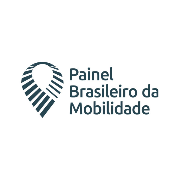
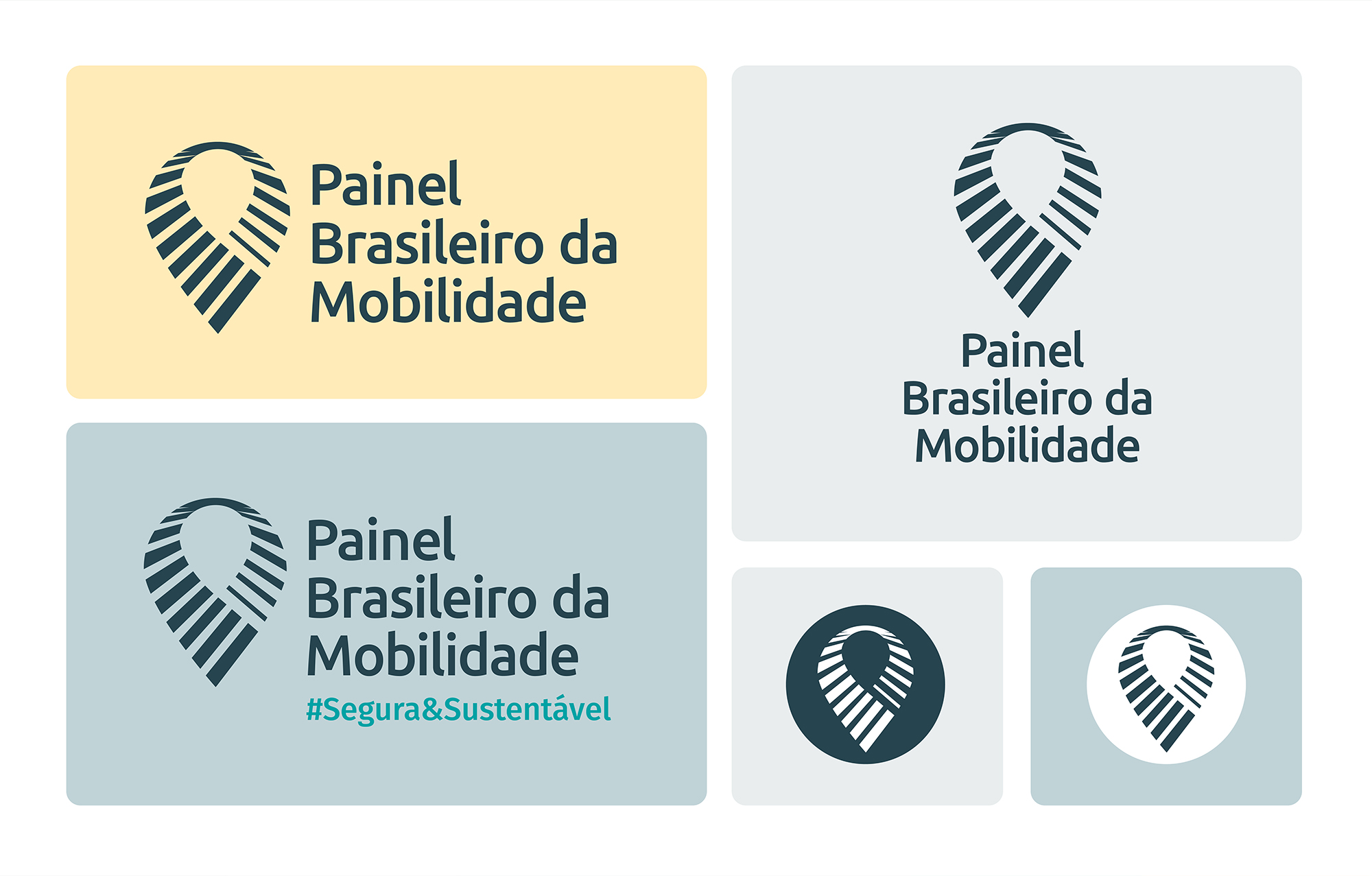
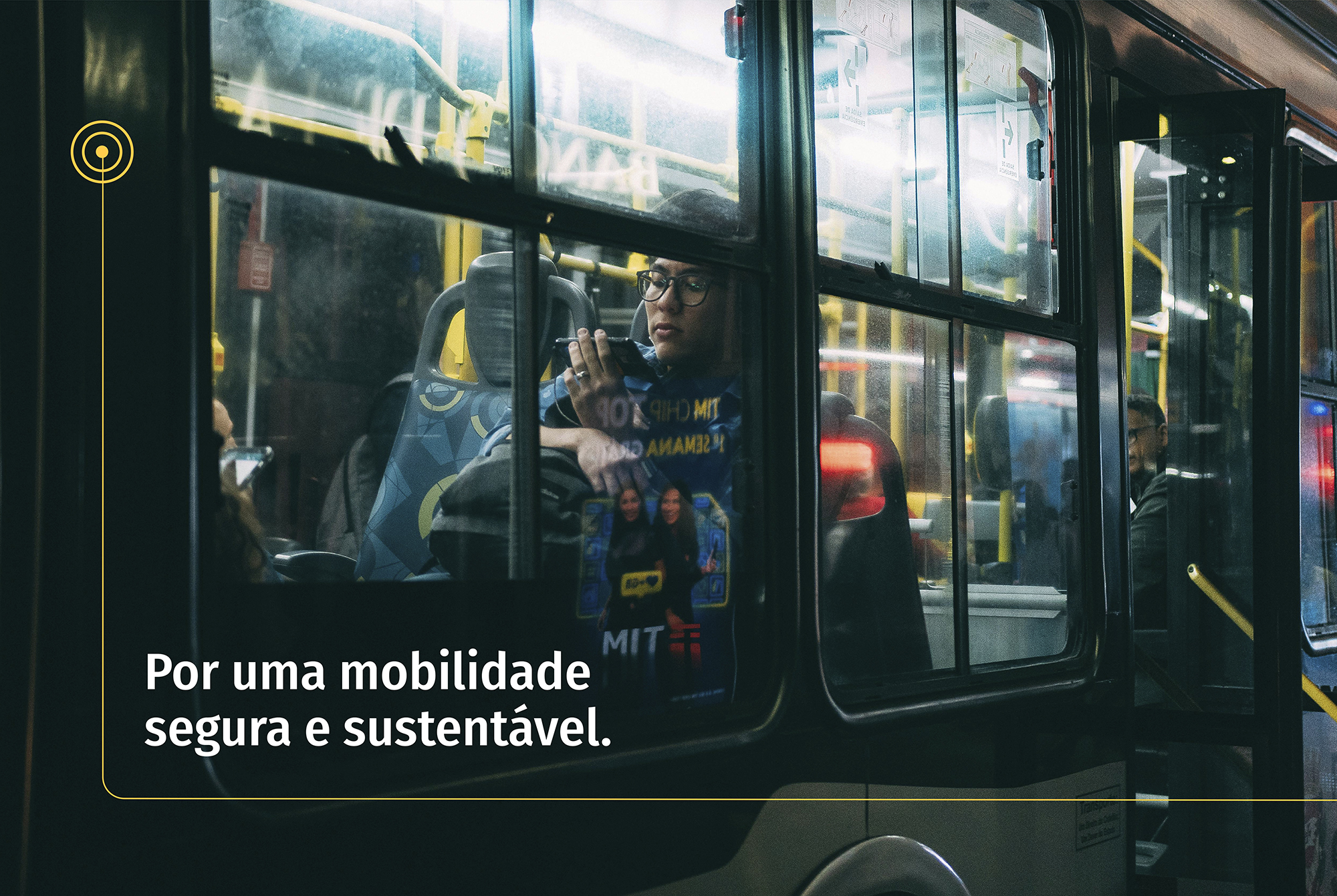
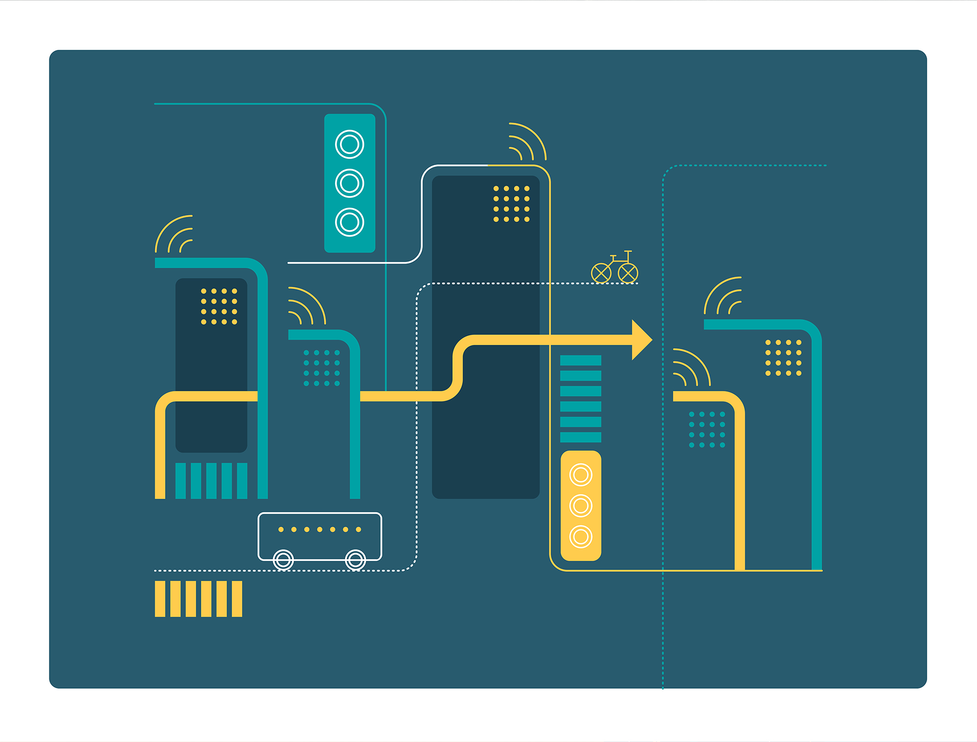
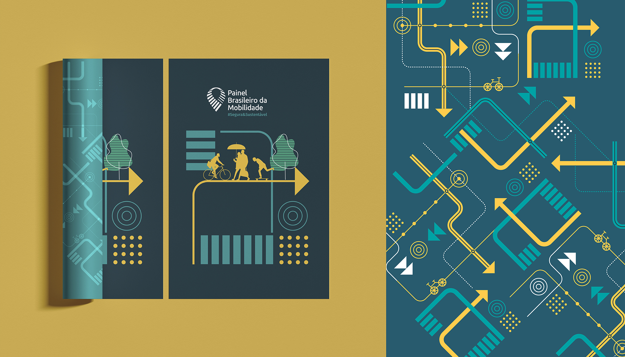
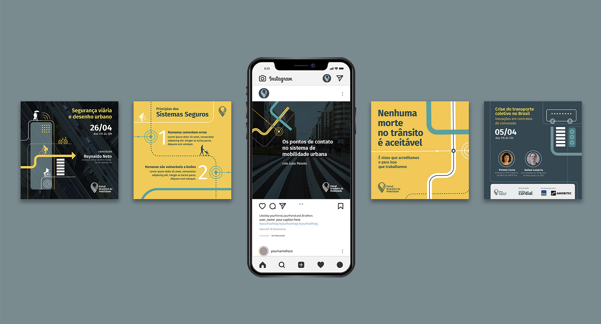
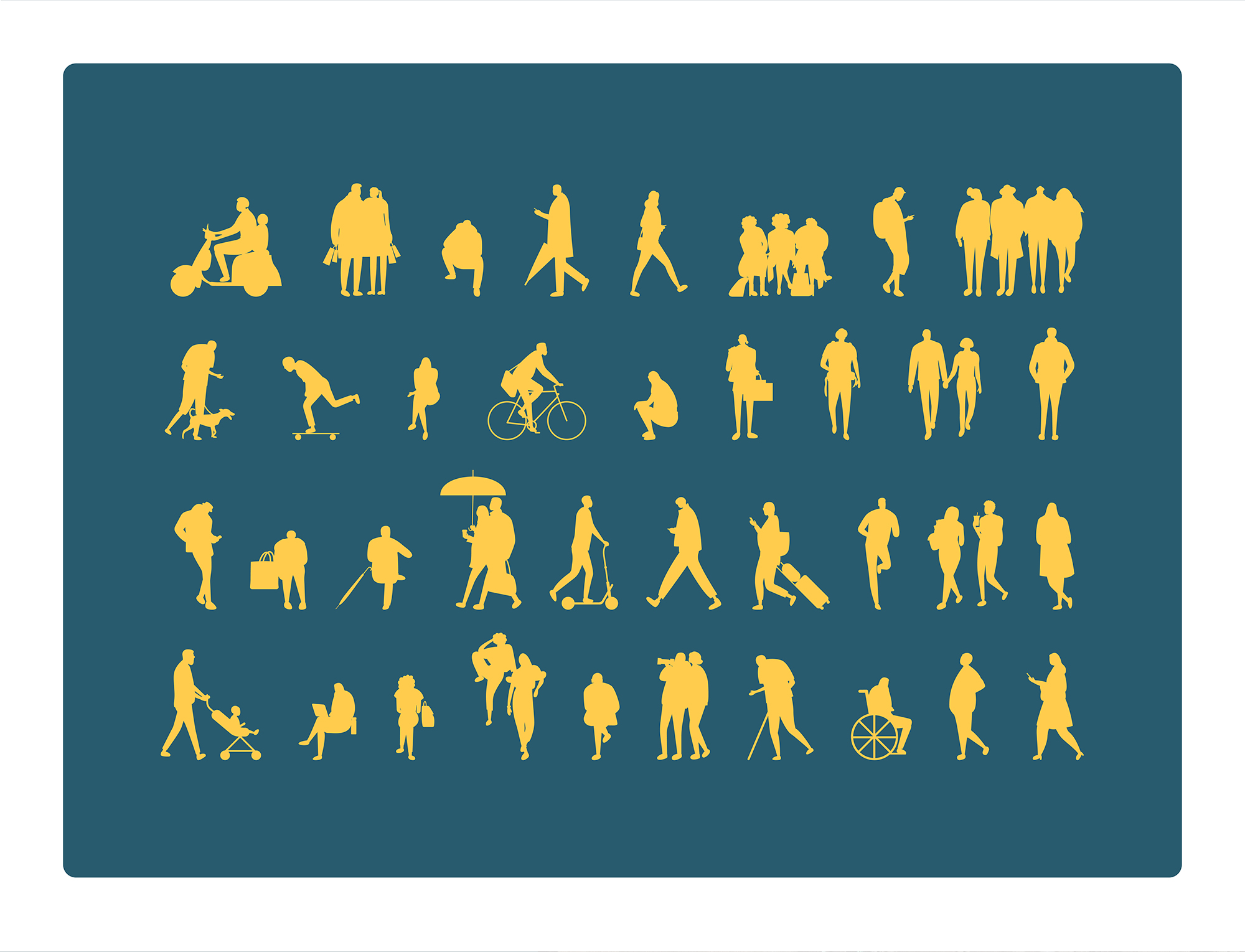
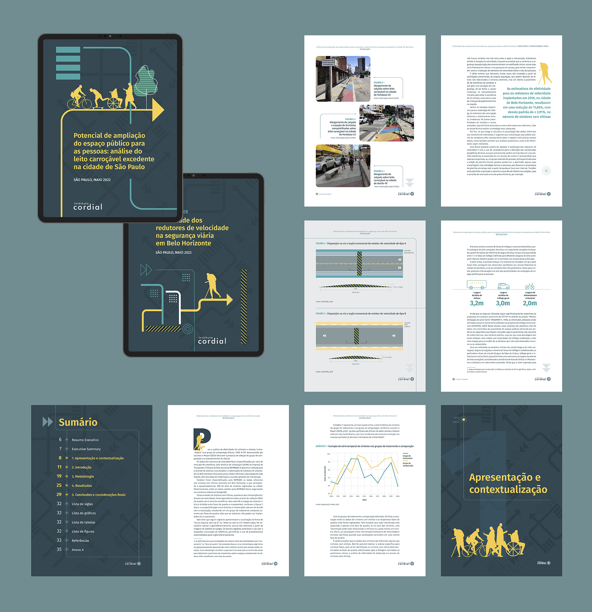
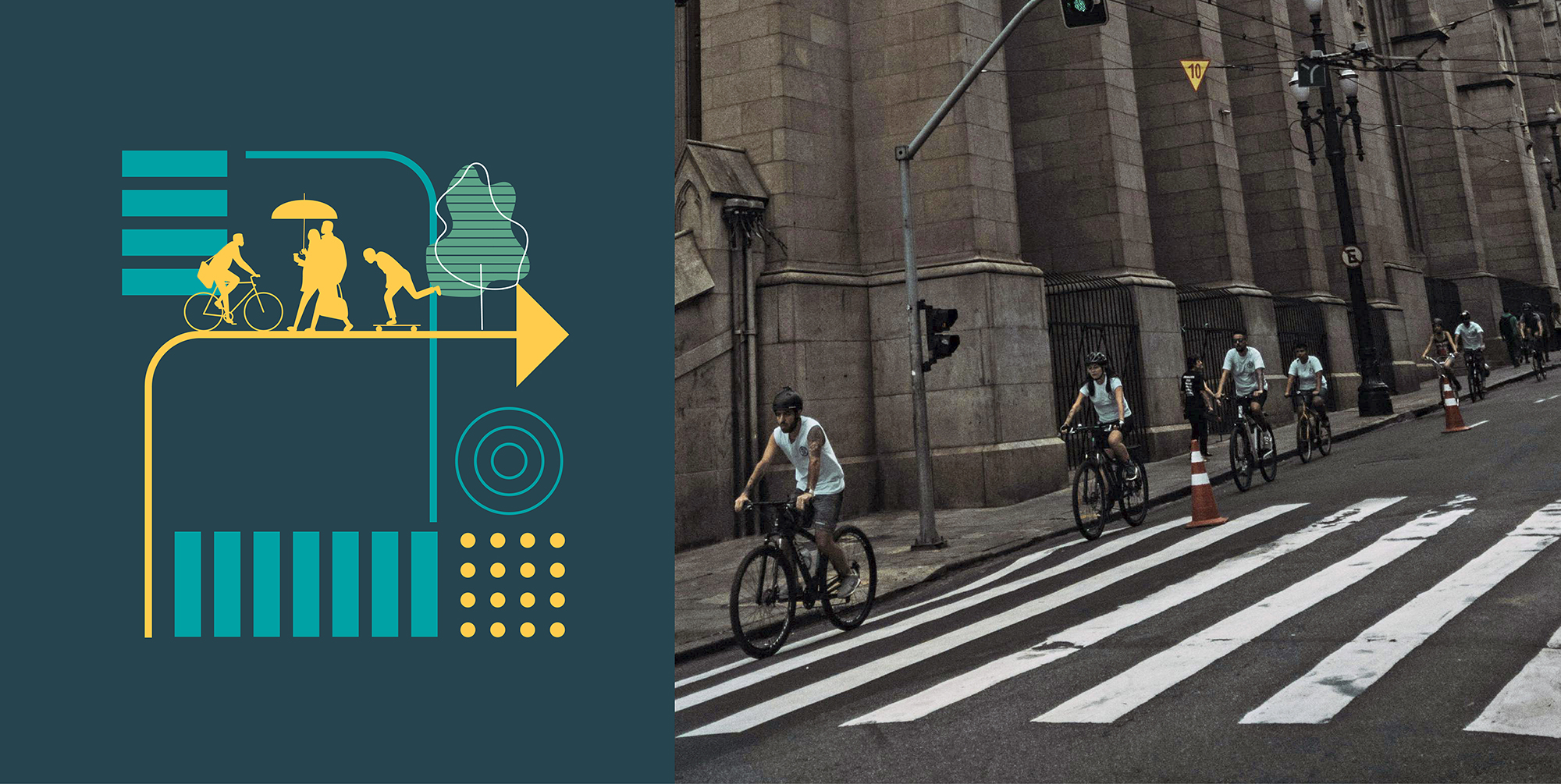
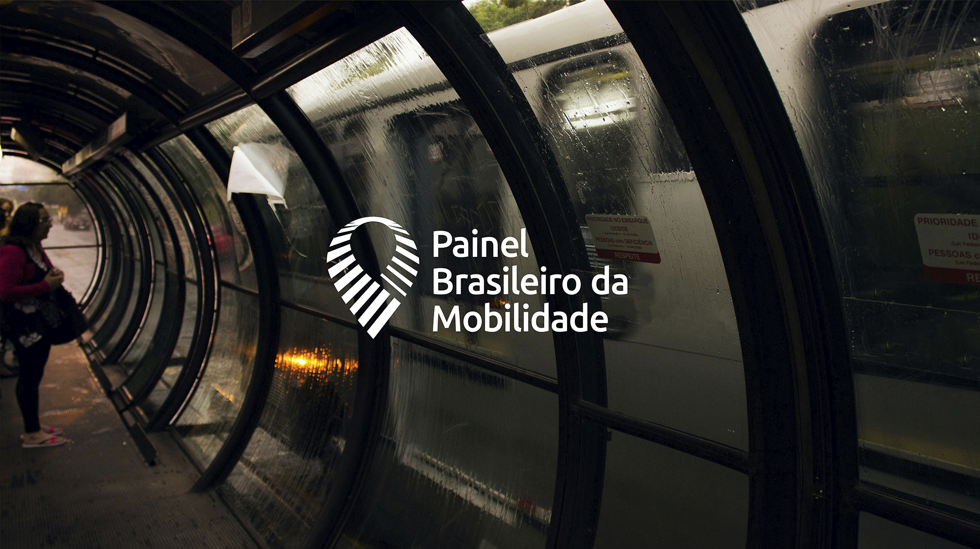
The Instituto Cordial, a center for articulation and research, has as one of its initiatives the PBM – Brazilian Mobility Panel. The goal of this panel is to contribute to reducing the environmental impacts of mobility, improving people’s quality of life, and, most importantly, eliminating traffic deaths in Brazilian cities.
Naru was invited to develop the visual identity for the PBM. We began the project by redesigning the logo, aiming for its application in various sizes.
Based on conversations with PBM researchers, we created a visual identity that represents the city, traffic, and its symbols, highlighting the main protagonists of this program: the citizens. The intention was to develop an identity that could be perceived from different perspectives, from general plans to more distant or closer cuts.
The final result is a versatile visual identity, composed of textures, illustrations, and icons, which allowed us to create a variety of support materials, ranging from social media to graphic design for printed publications.
CLIENT: Instituto Cordial | YEAR: 2022
Visual Identity | Social Media | Graphic Design


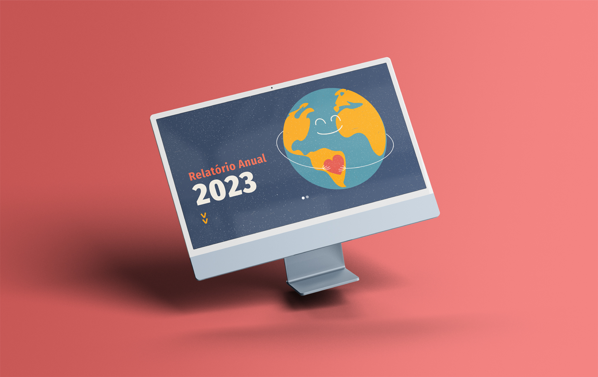
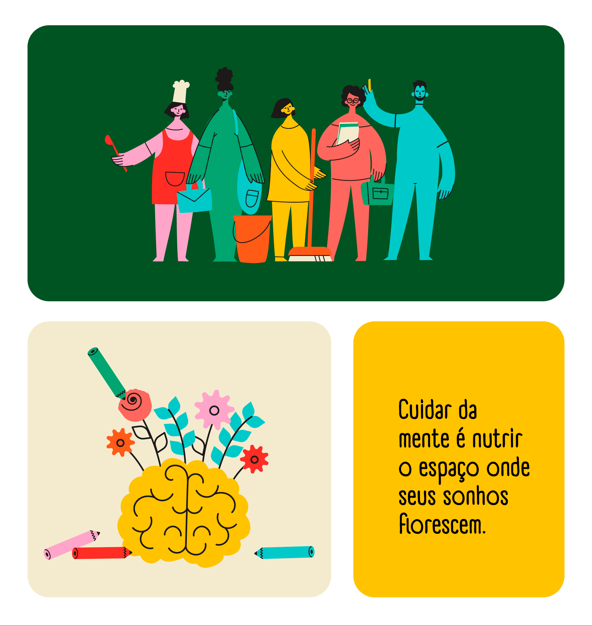
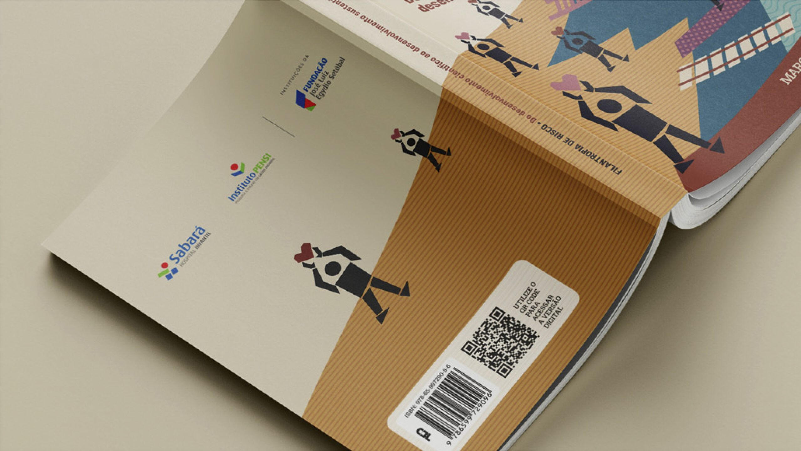
For the 2023 Annual Report of Fundação José Luiz Egydio Setúbal, we created the graphic design for the microsite and the printed edition. The report was developed to clearly present the foundation’s various areas of action and the projects carried out throughout the year. Vibrant colors and playful illustrations were used to reflect the foundation’s mission and its focus on children’s health.
CLIENT: Fundação José Luiz Egydio Setúbal | YEAR: 2024
Website | Graphic Design | Layout | Image Editing | Infographics


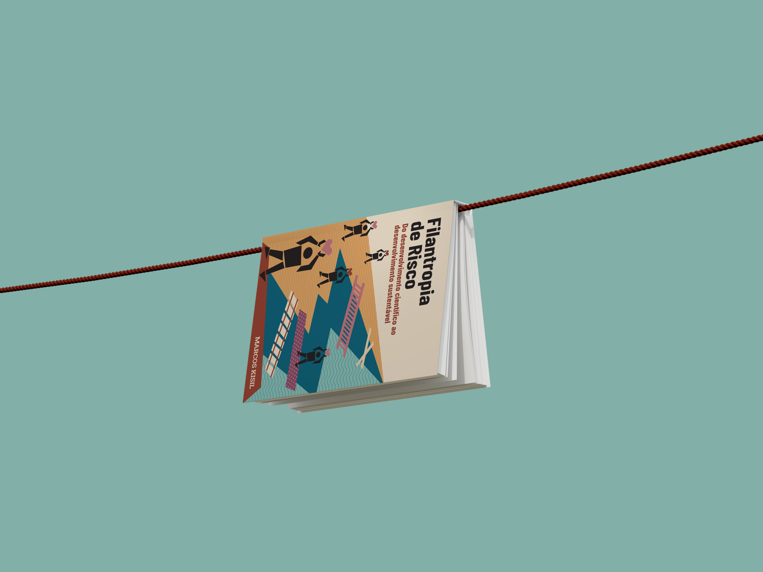
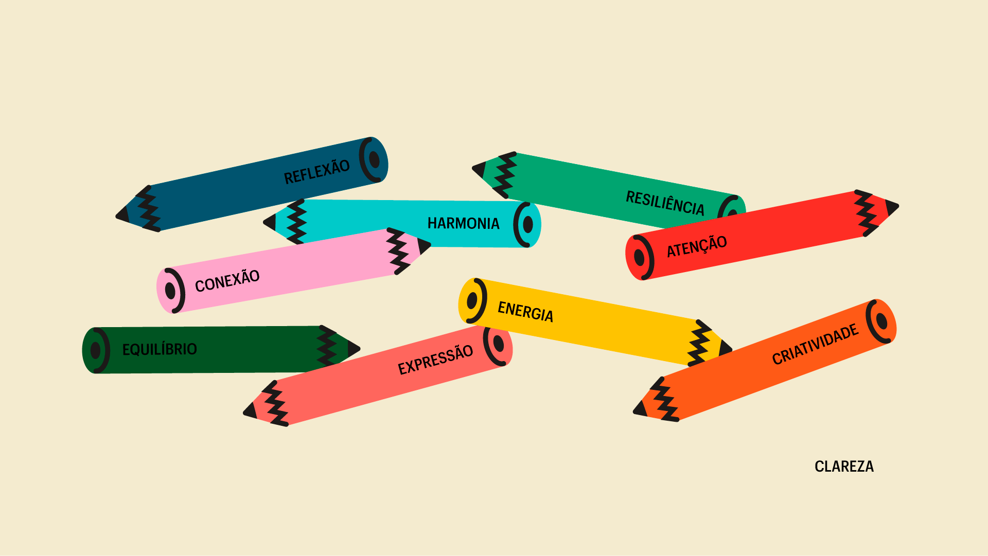
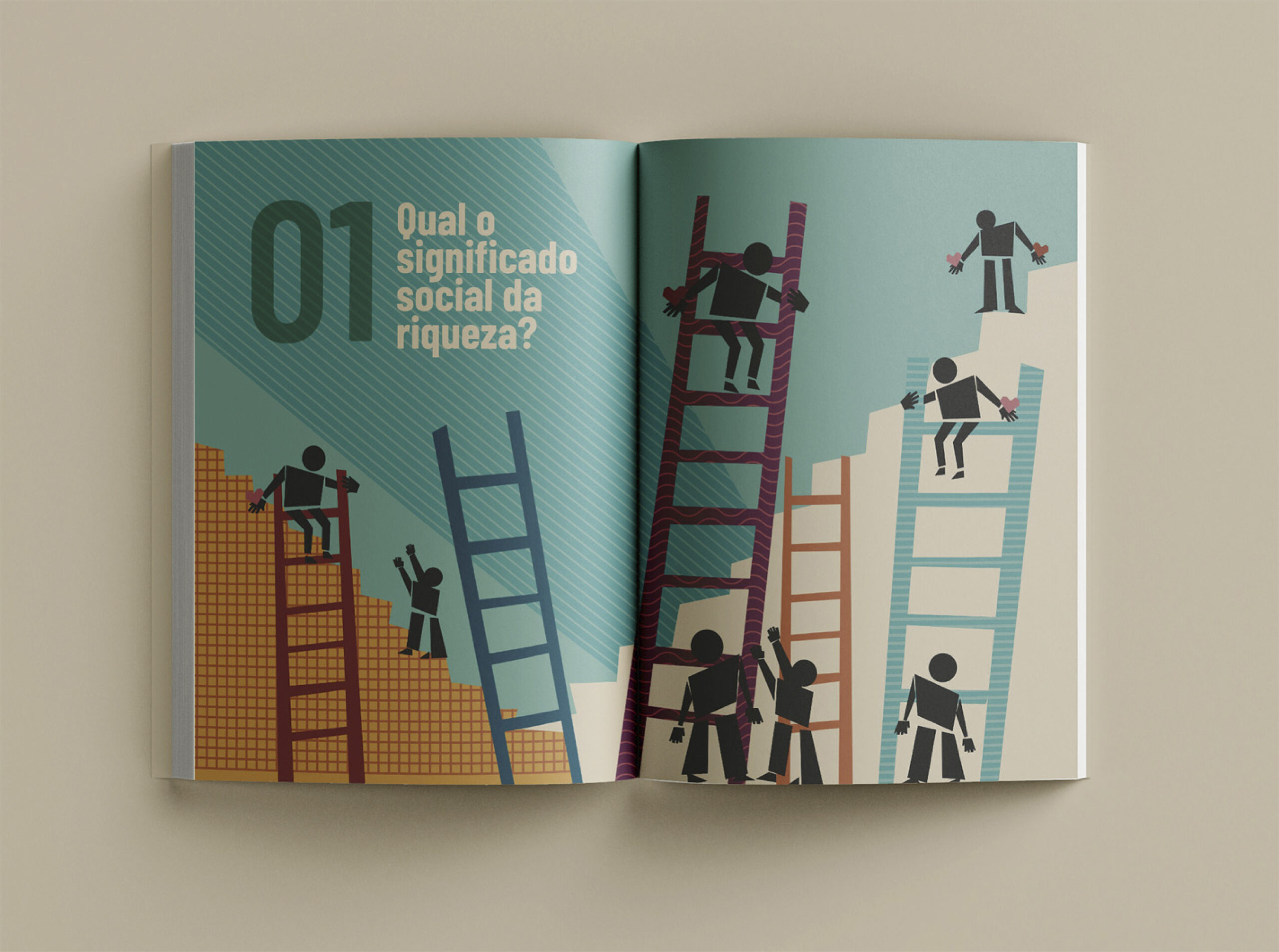
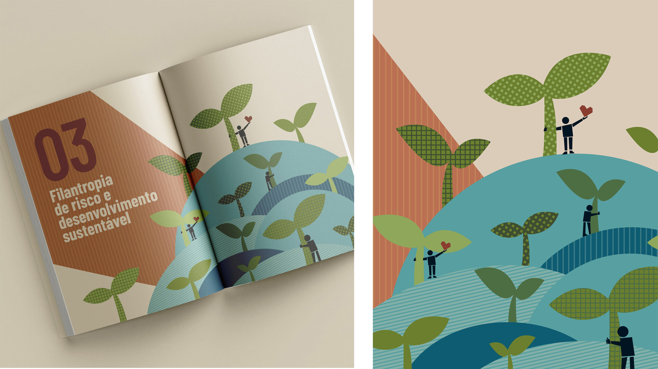
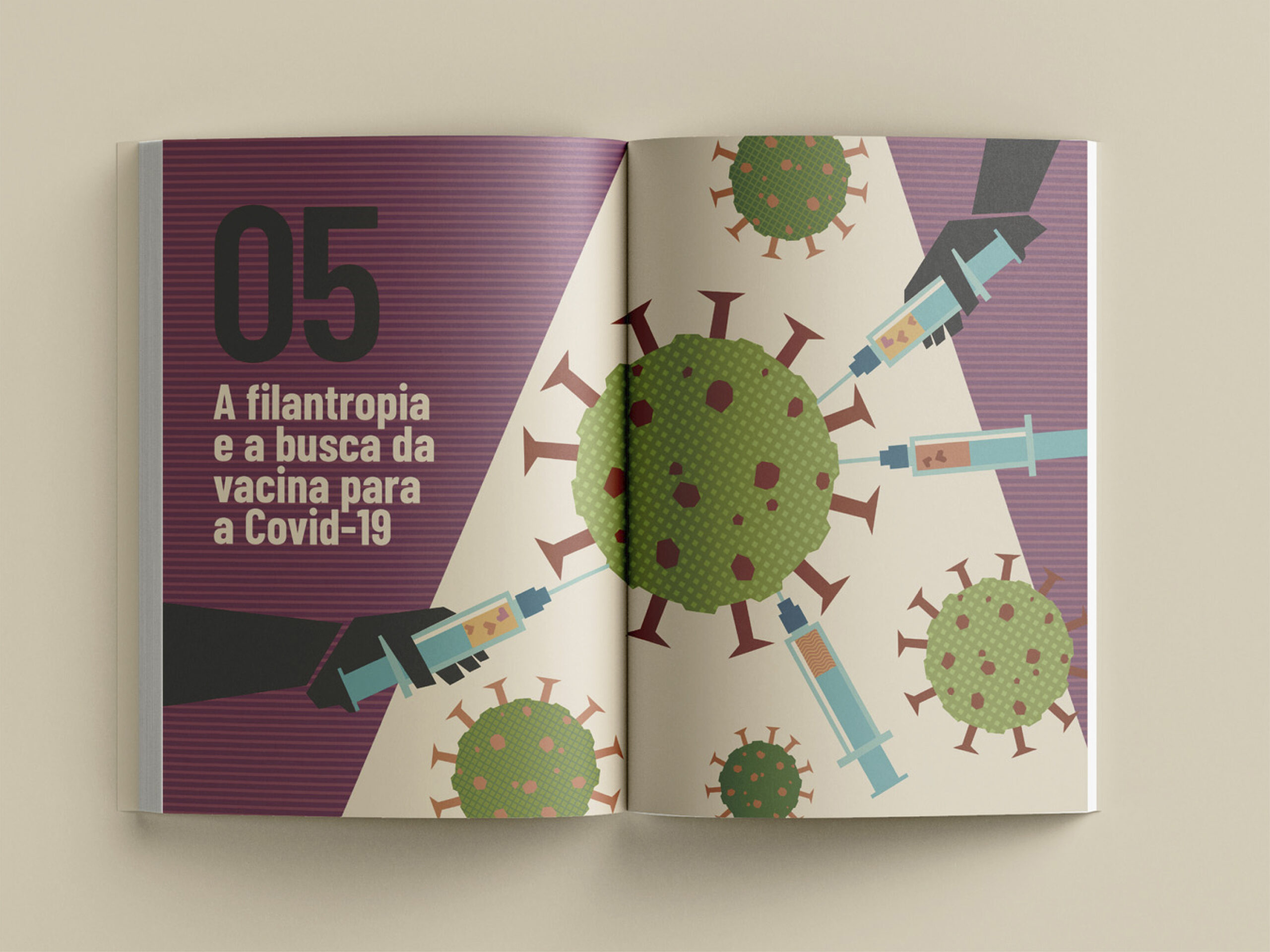
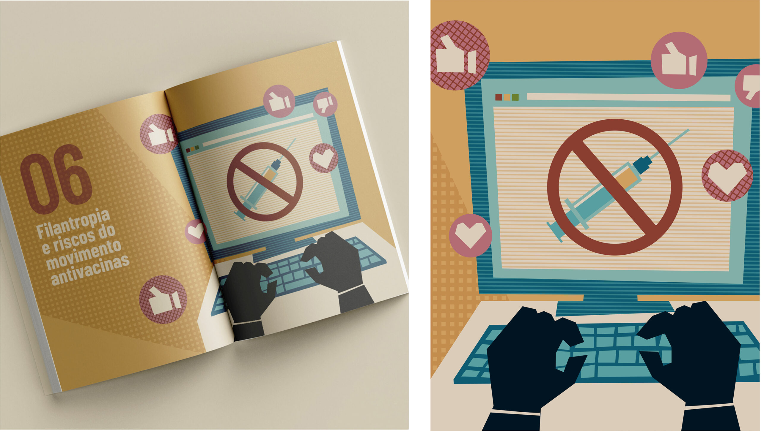
We believe that reading should not only be informative but also engaging and visually stimulating. Therefore, our graphic design project prioritized the creation of customized illustrations for each chapter, adapting colors and infographics to create a unique project and facilitate understanding. The illustrations developed by our designer and illustrator, Gabi Rocha, were conceived not only as decorative elements but also as visual tools that complement the text, facilitate comprehension, and add layers of meaning.
CLIENT: Fundação José Luiz Egydio Setúbal | YEAR: 2024
Graphic Design | Layout | Illustrations | Infographics


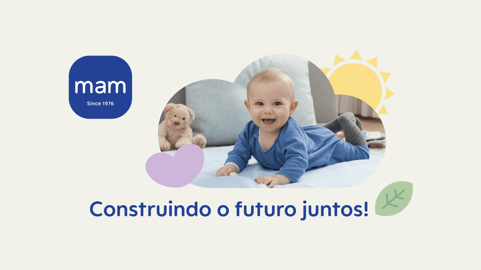
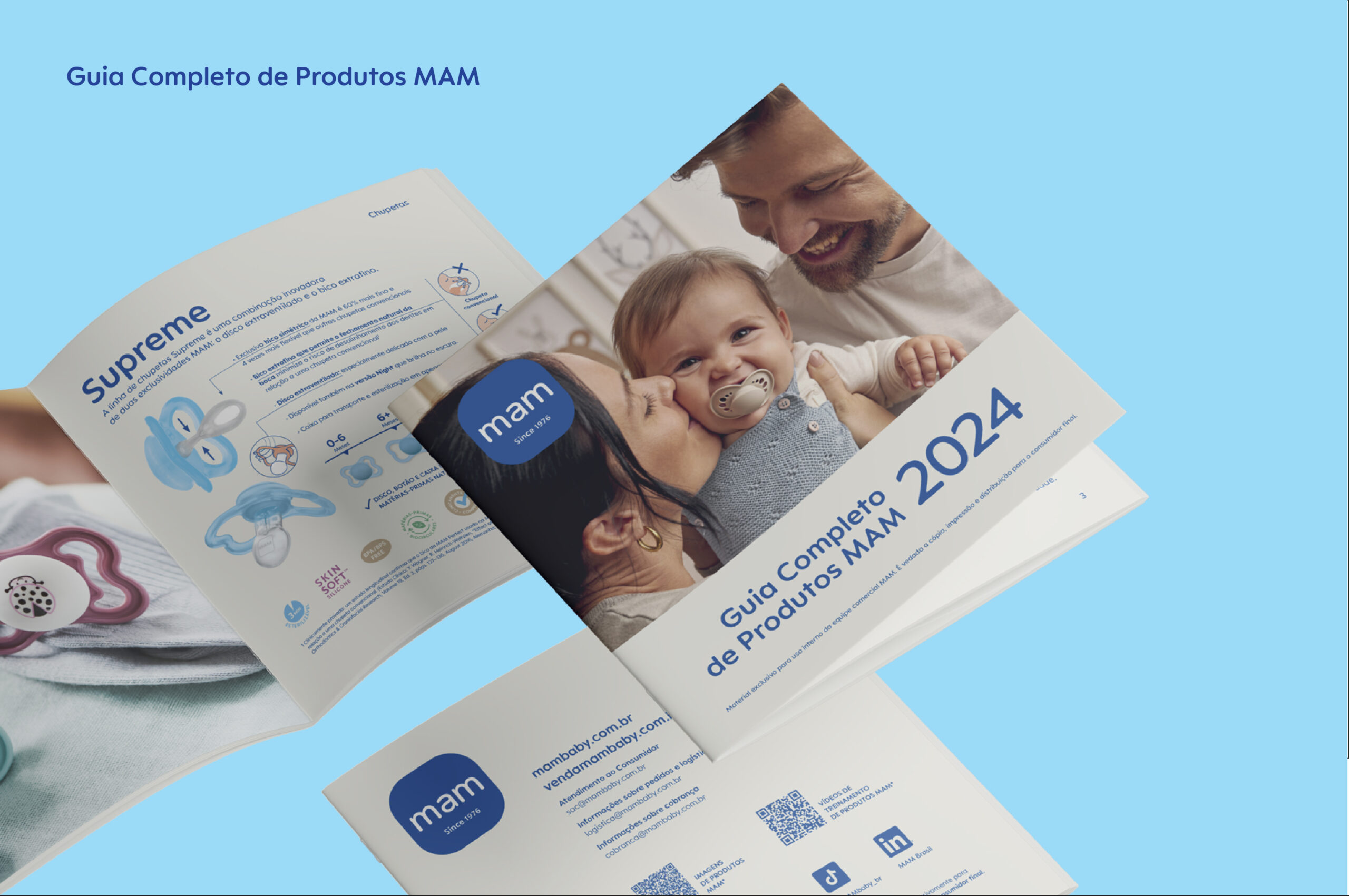
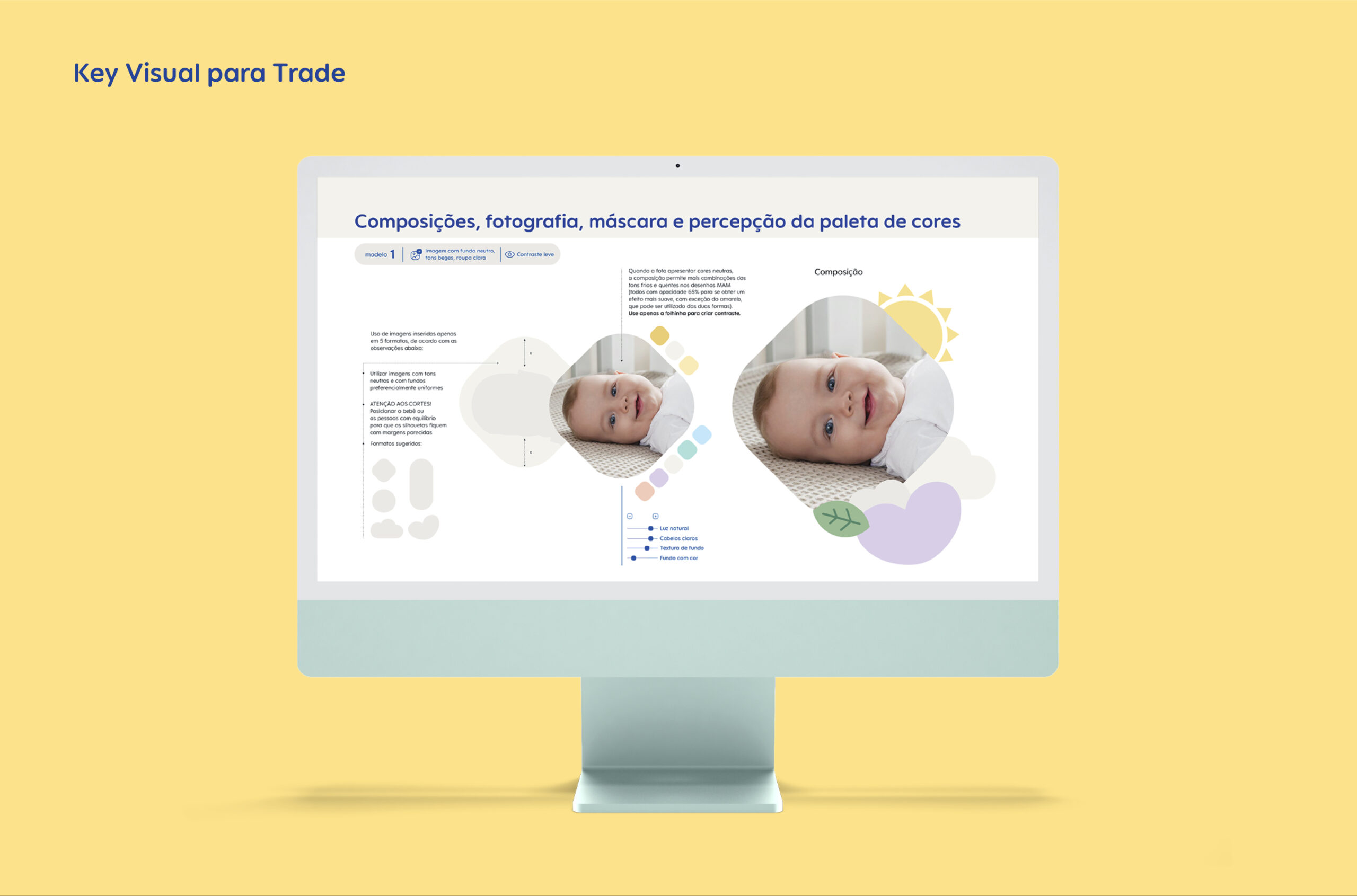
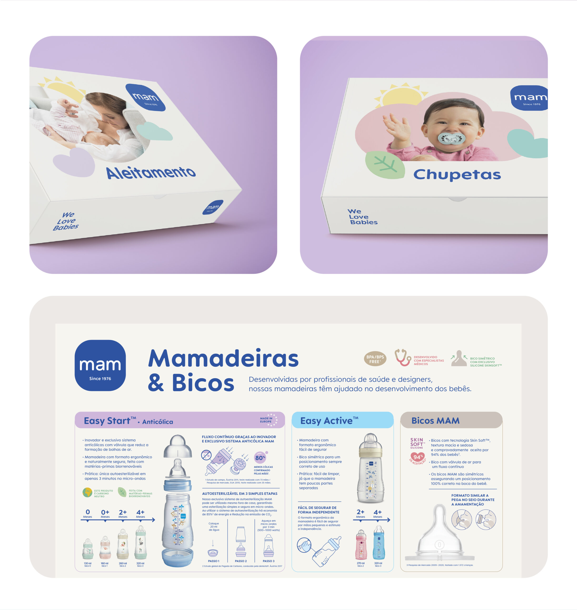
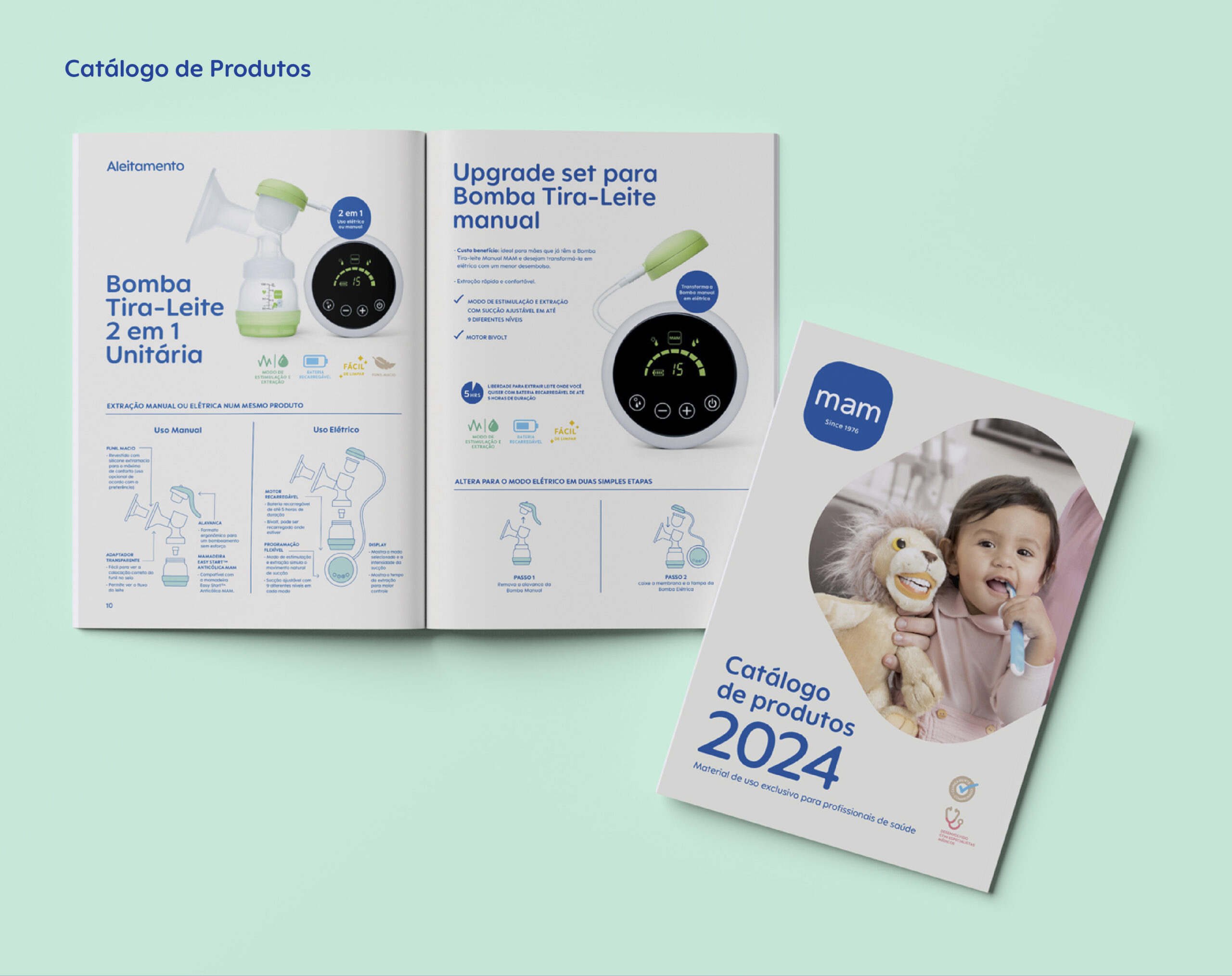
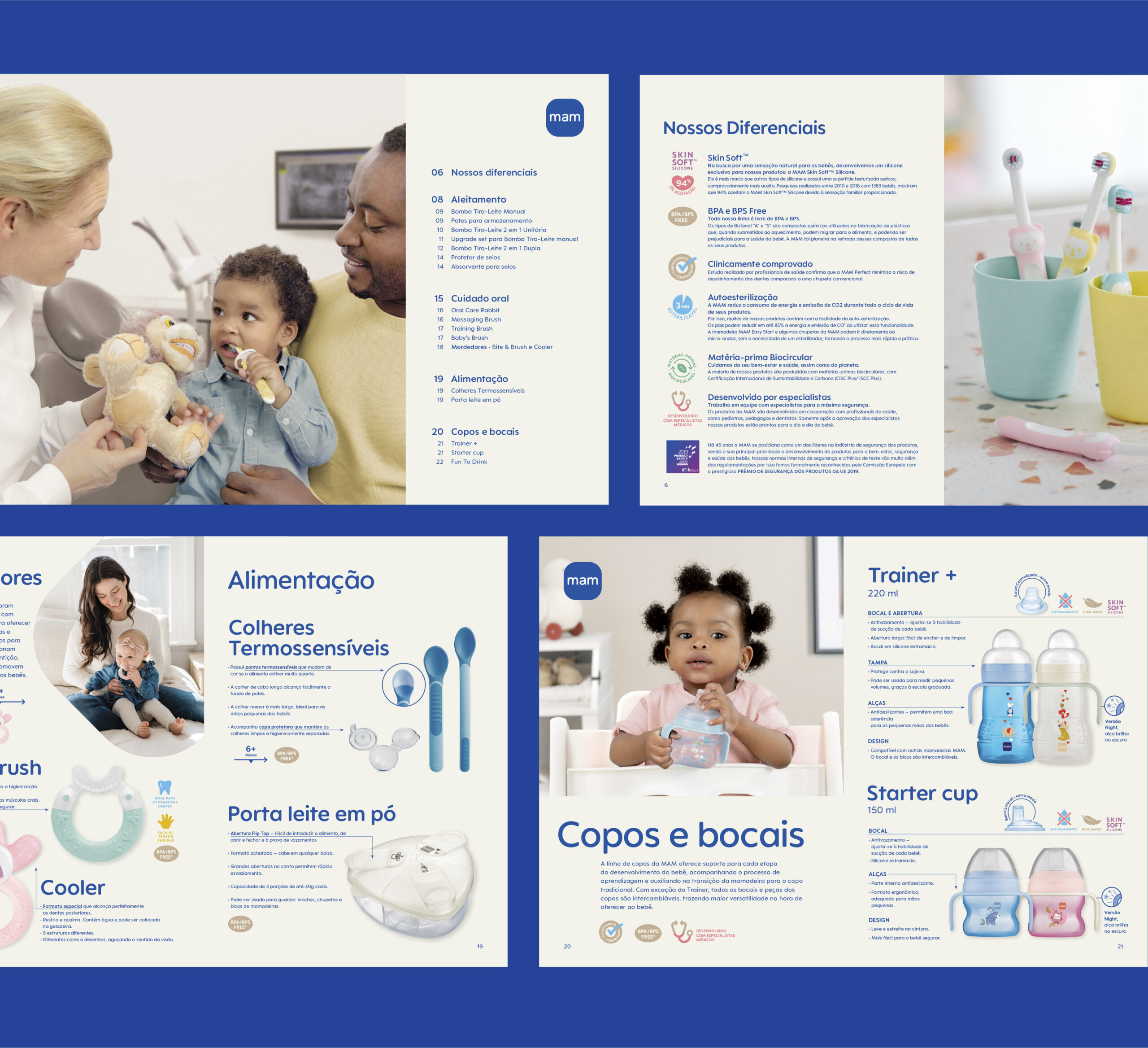
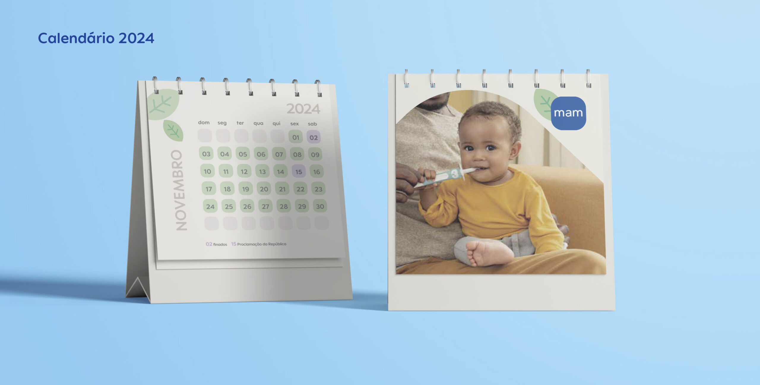
In 2024, MAM Baby, a leading company in infant care products, underwent a global rebranding. As a client of Naru since 2018, MAM Brasil hired us to adapt and implement its new visual identity in the Brazilian market, ensuring that the global guidelines were effectively translated to the local context. This process included a thorough market analysis and adjustments to the brand’s positioning, always focusing on the specific needs of the Brazilian audience.
To support the launch of the new branding, we created product showcases for the sales team. These showcases reflect the brand’s new identity, facilitating the presentation and promotion of the products effectively.
CLIENT: MAM Baby Brasil | YEAR: 2024
Branding | Key Visuals | Packaging | Catalogs


Livia Coelho


Ivan Oliveira
Medical Relationship Manager at MAM Baby Brazil
Visual identity that evolves with the company.
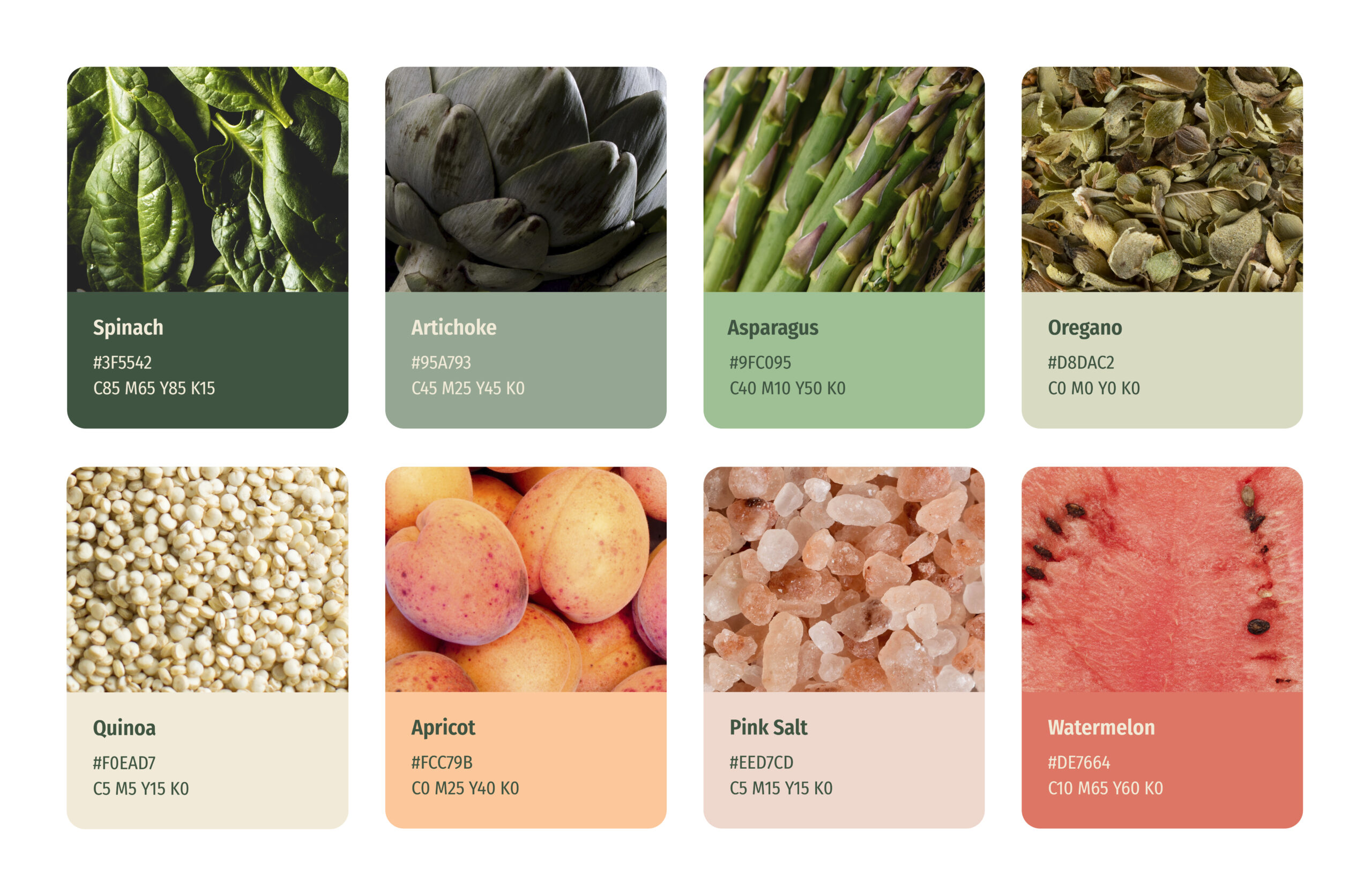
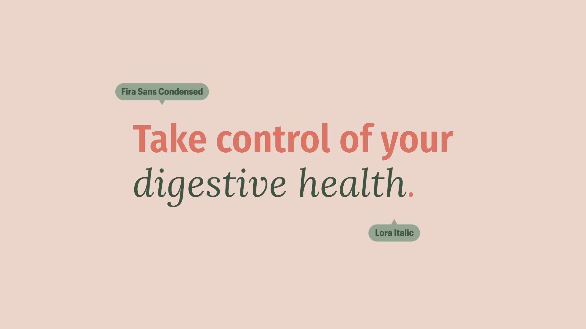
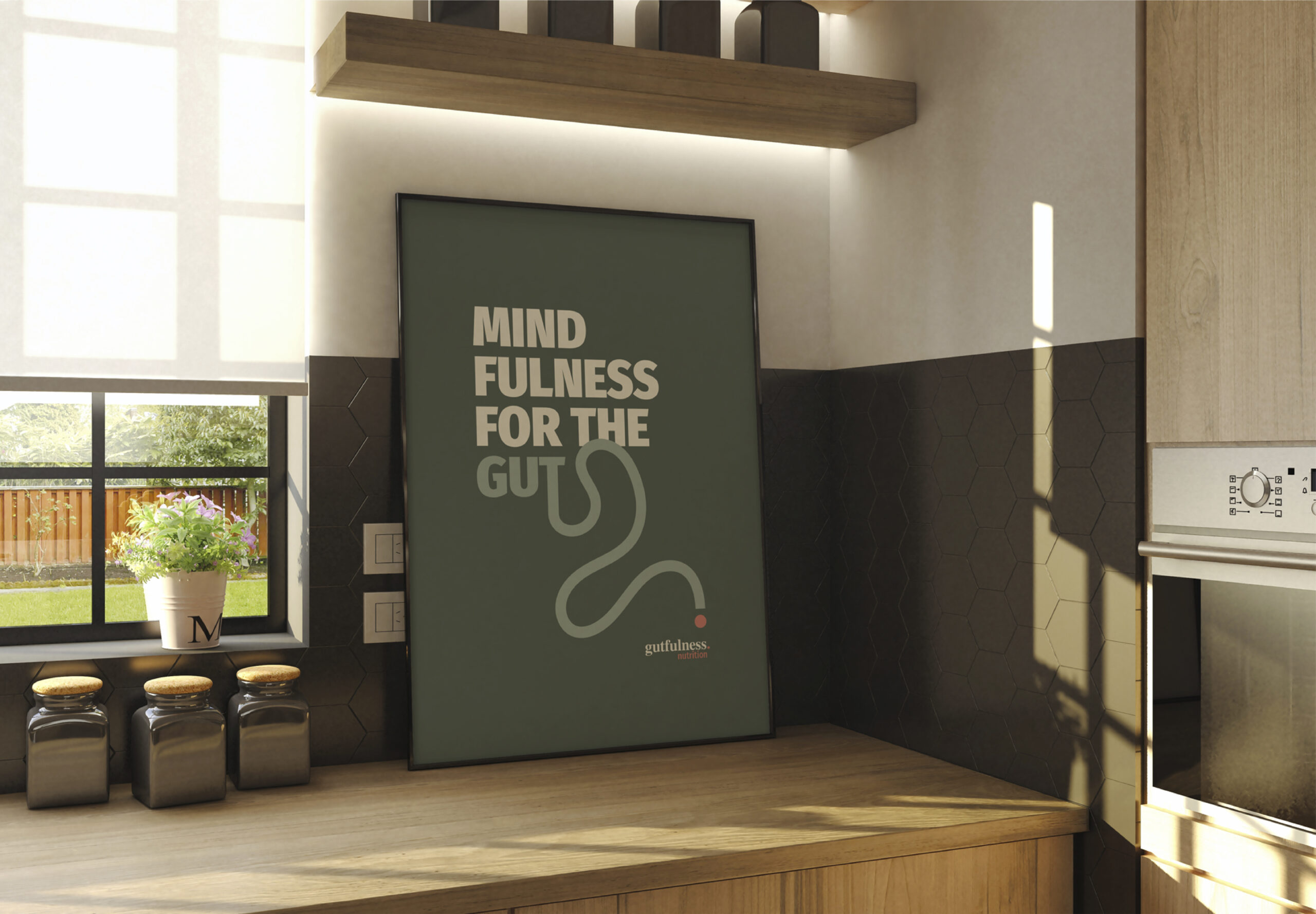
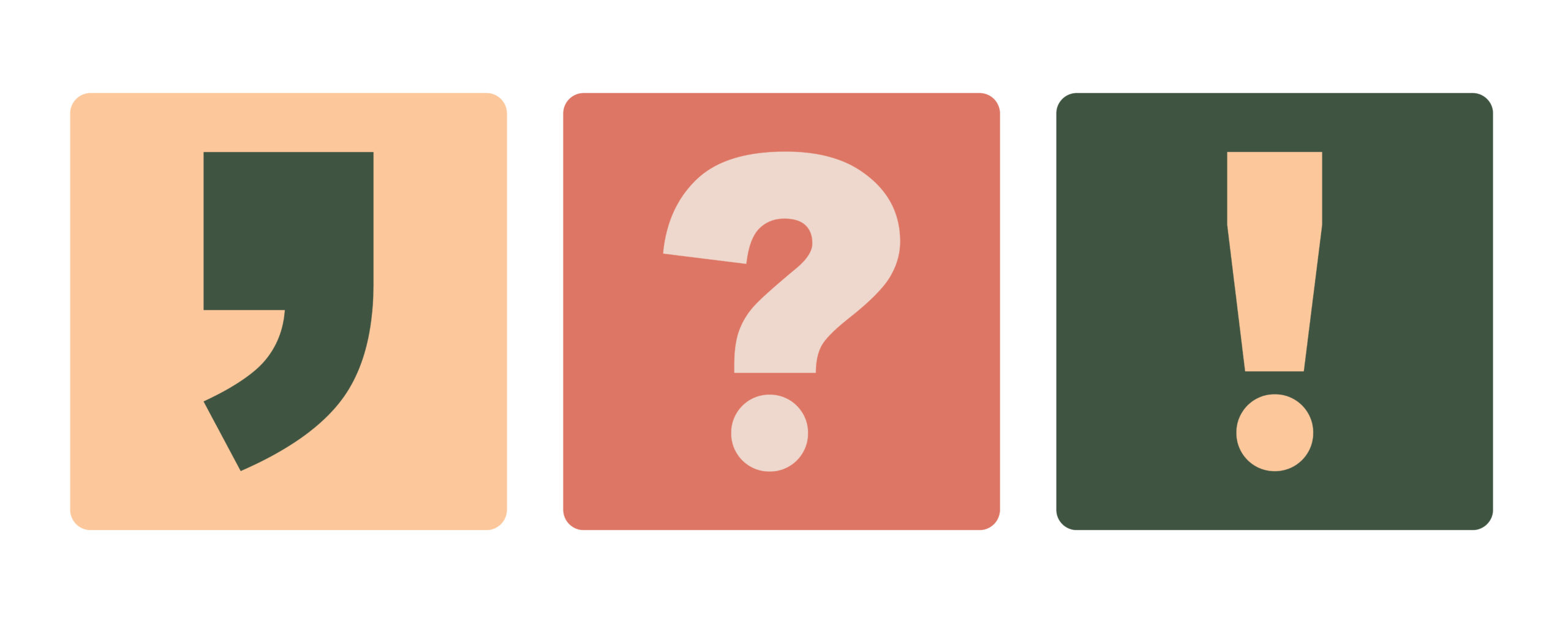
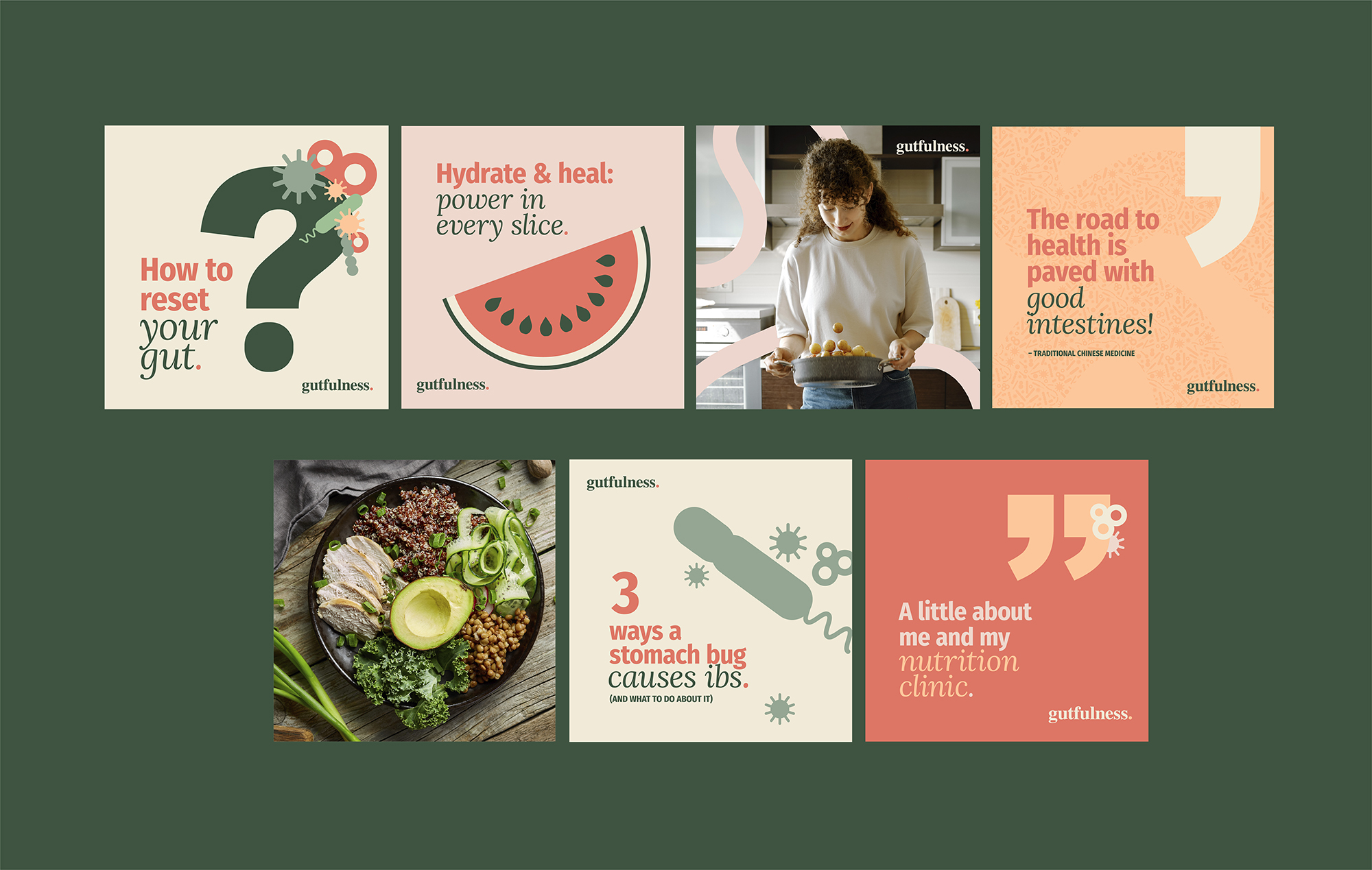
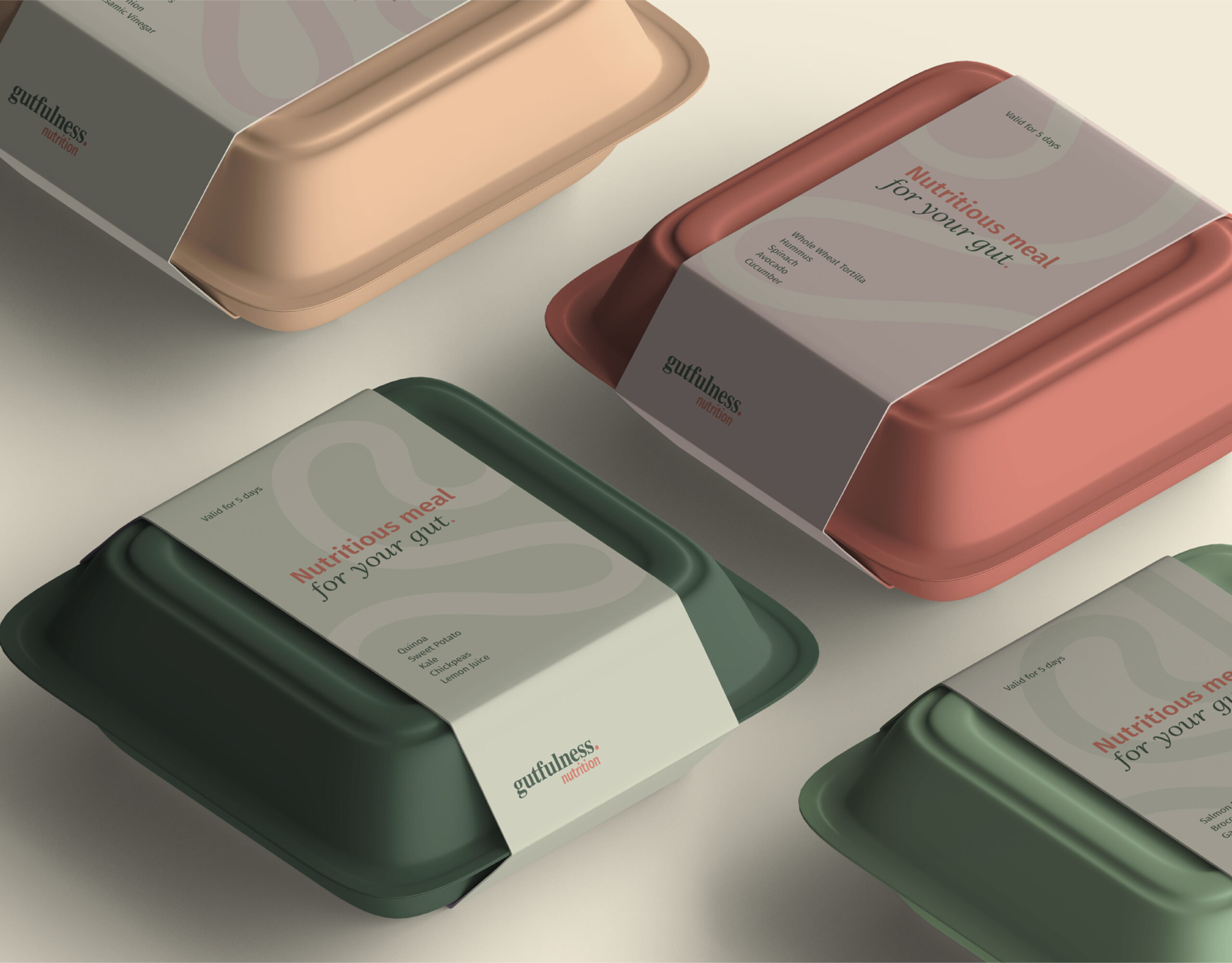
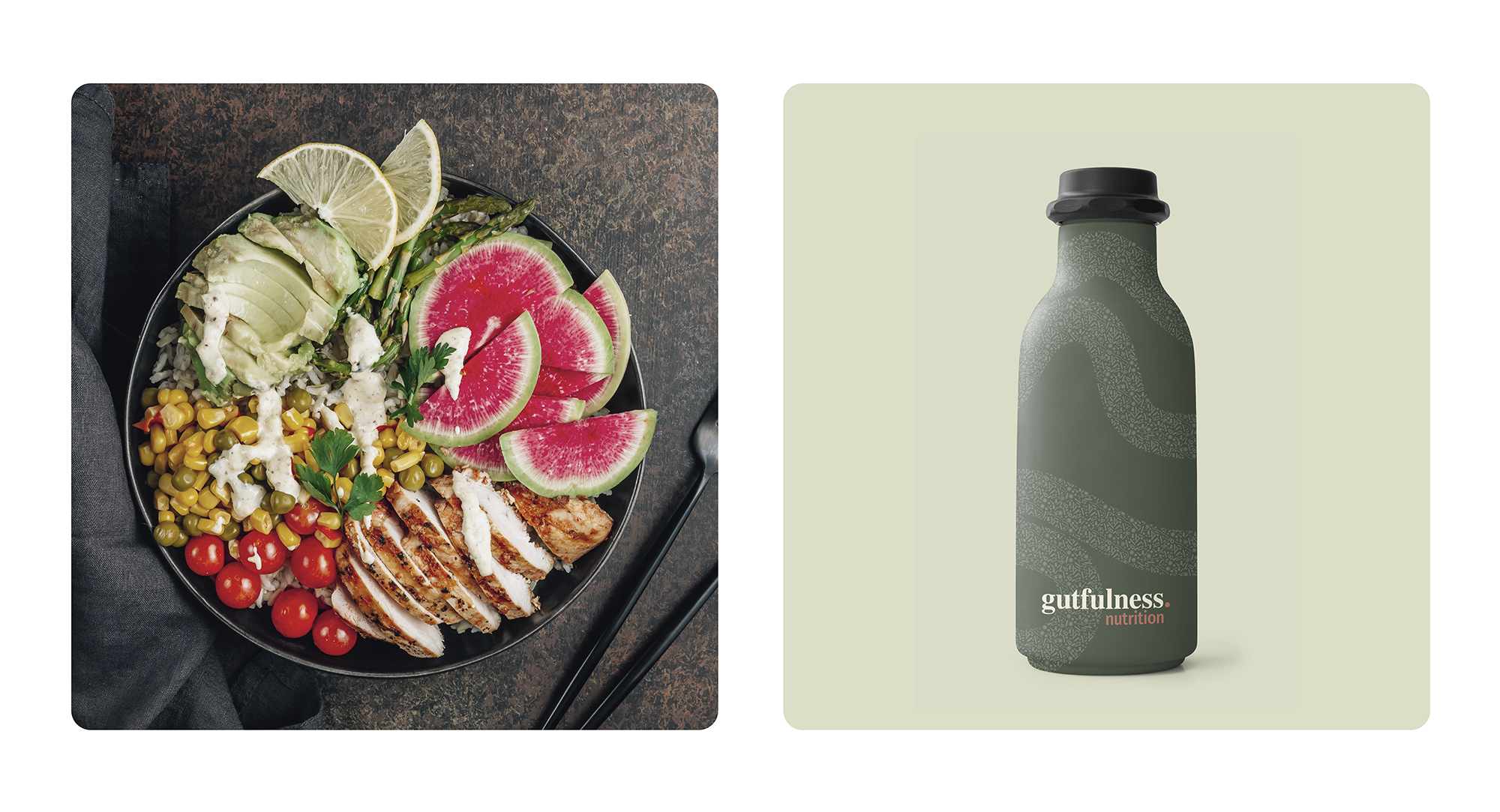
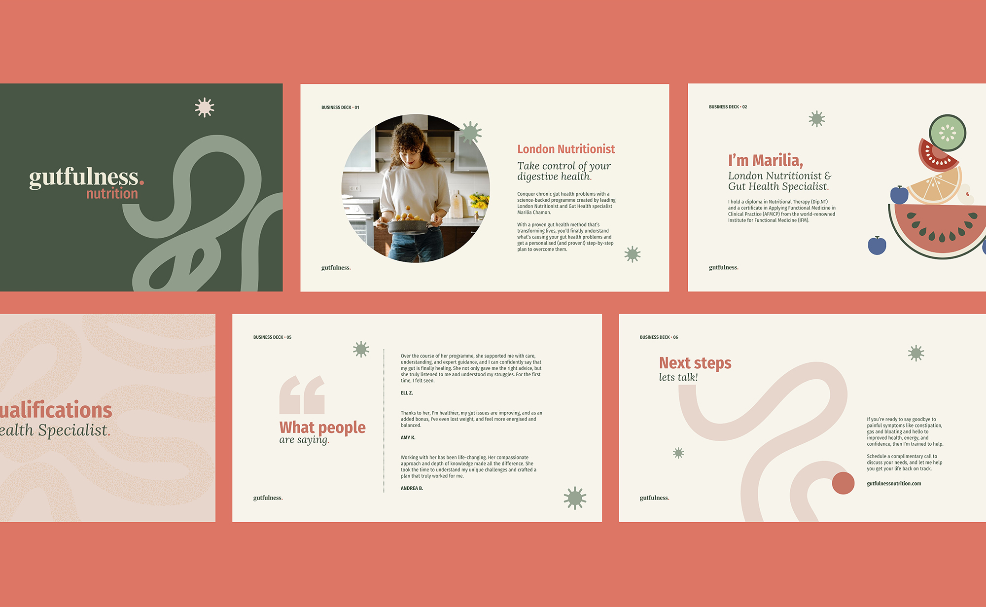
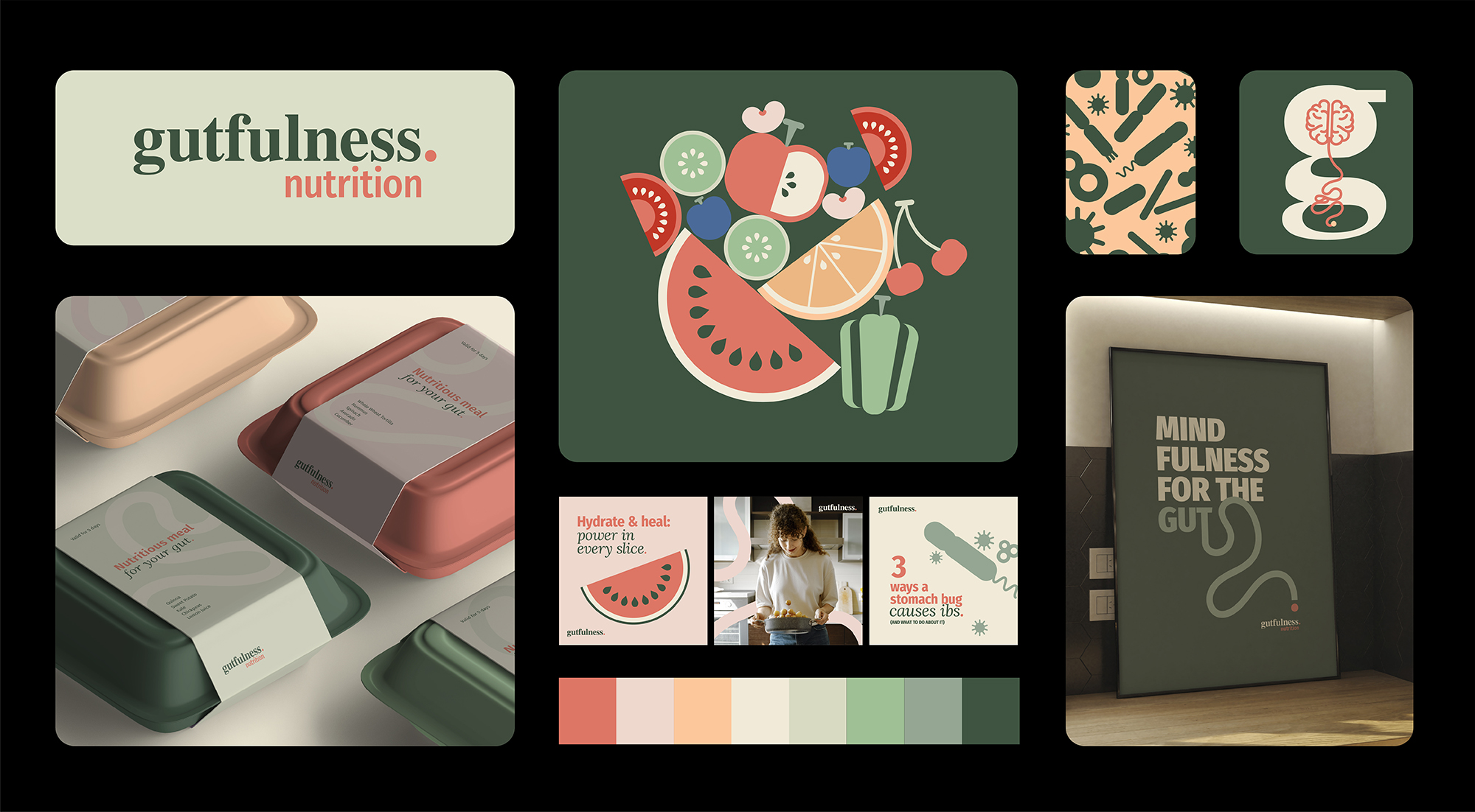
Gutfulness Nutrition is a London-based company founded by nutritional therapist and gut health specialist Marilia Chamon. We were hired to create a branding that would guide its visual identity and reflect its market positioning.
After conducting detailed research (desk research), we presented two strategic paths, each with a corresponding moodboard:
Guthealth Lifestyle – An accessible, educational, and empathetic positioning, emphasizing the impact of nutrition on gut health and well-being.
Expertise Guthealth – A focus on know-how, highlighting the brand’s deep technical knowledge in promoting health through therapeutic nutrition.
Initially, the company adopted the Guthealth Lifestyle concept, communicating in a clear and educational manner. As the brand grew, we were called to conduct the rebranding, now guided by the Expertise Guthealth concept, consolidating Gutfulness Nutrition as a reference in gut health based on science and expertise.
CLIENT: Gutfulness Nutrition | YEAR: 2024
Branding | Visual Identity


Marilia Chamon


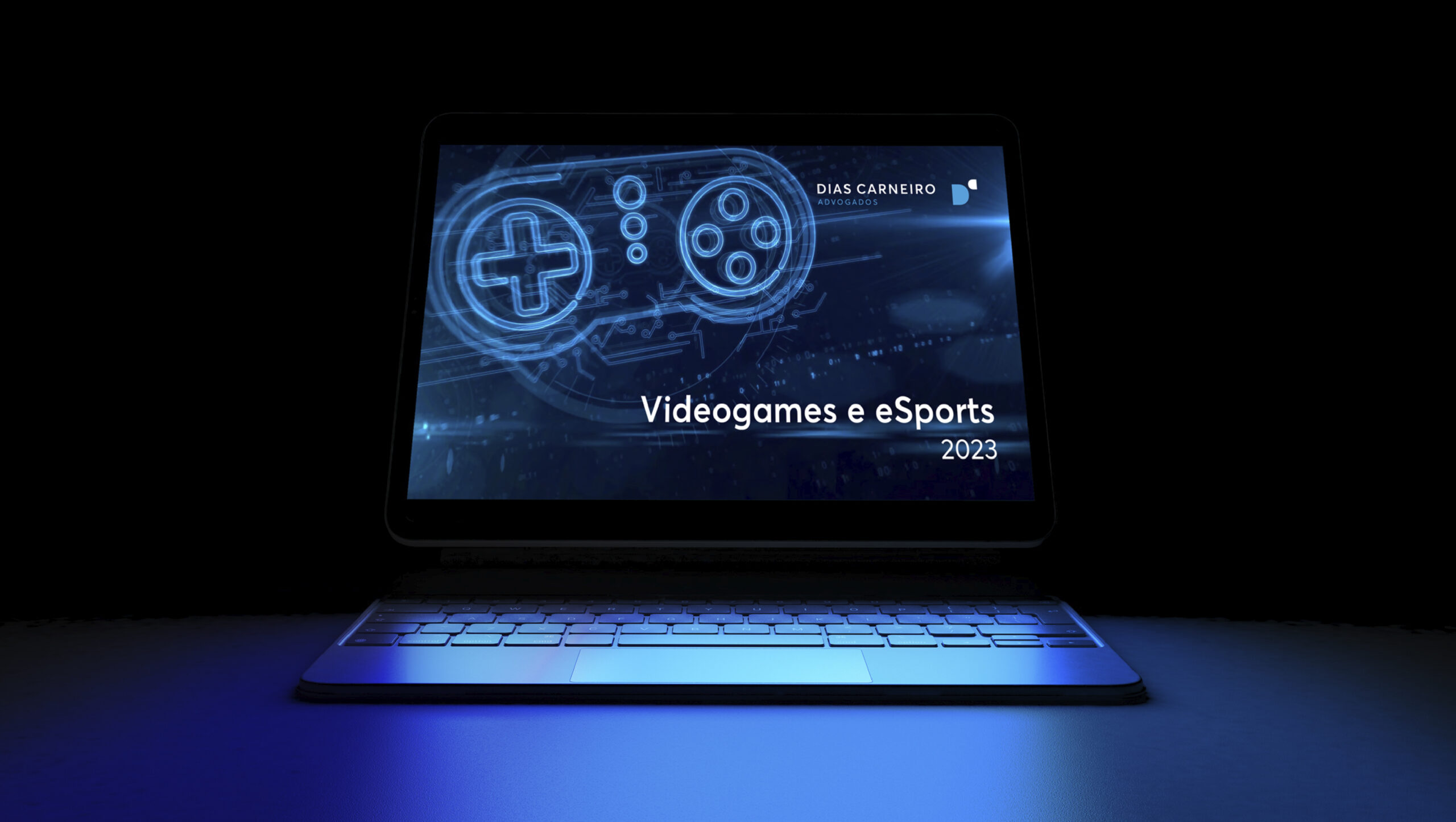
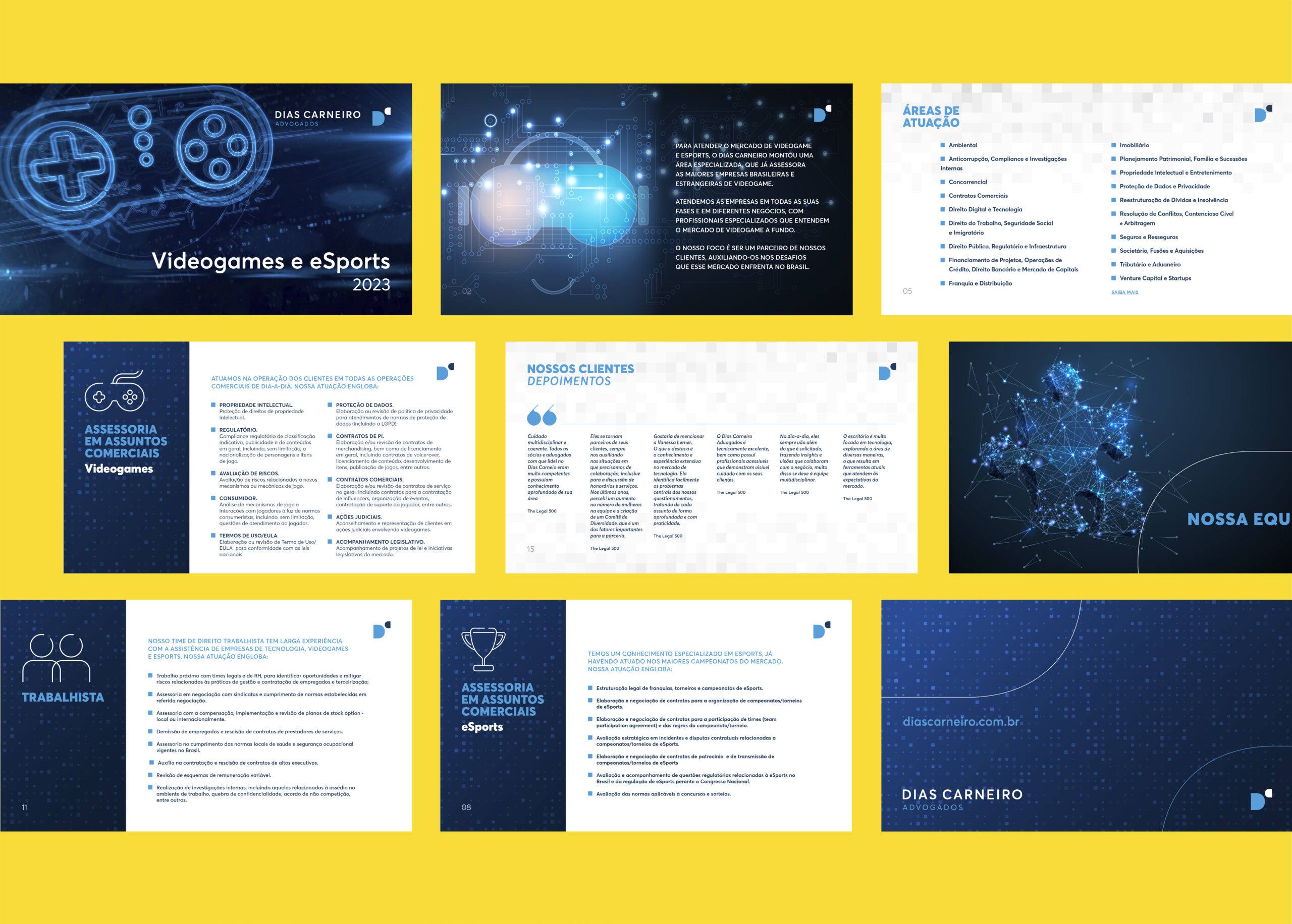
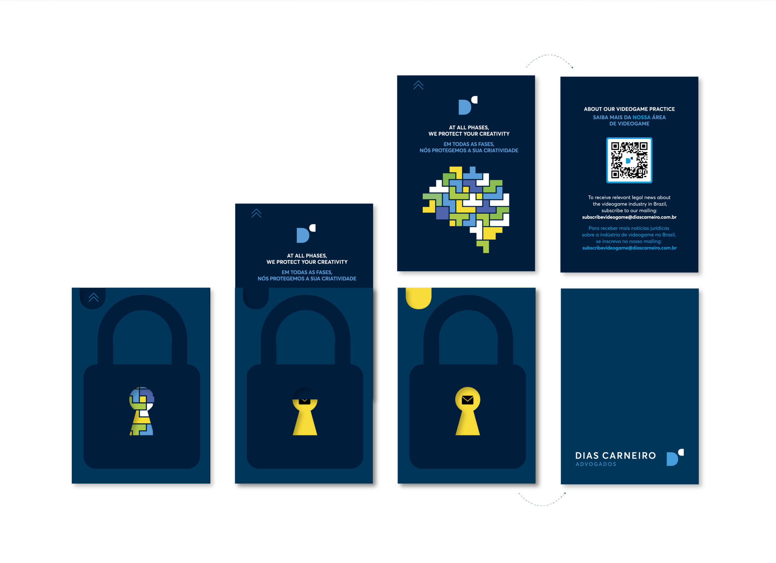
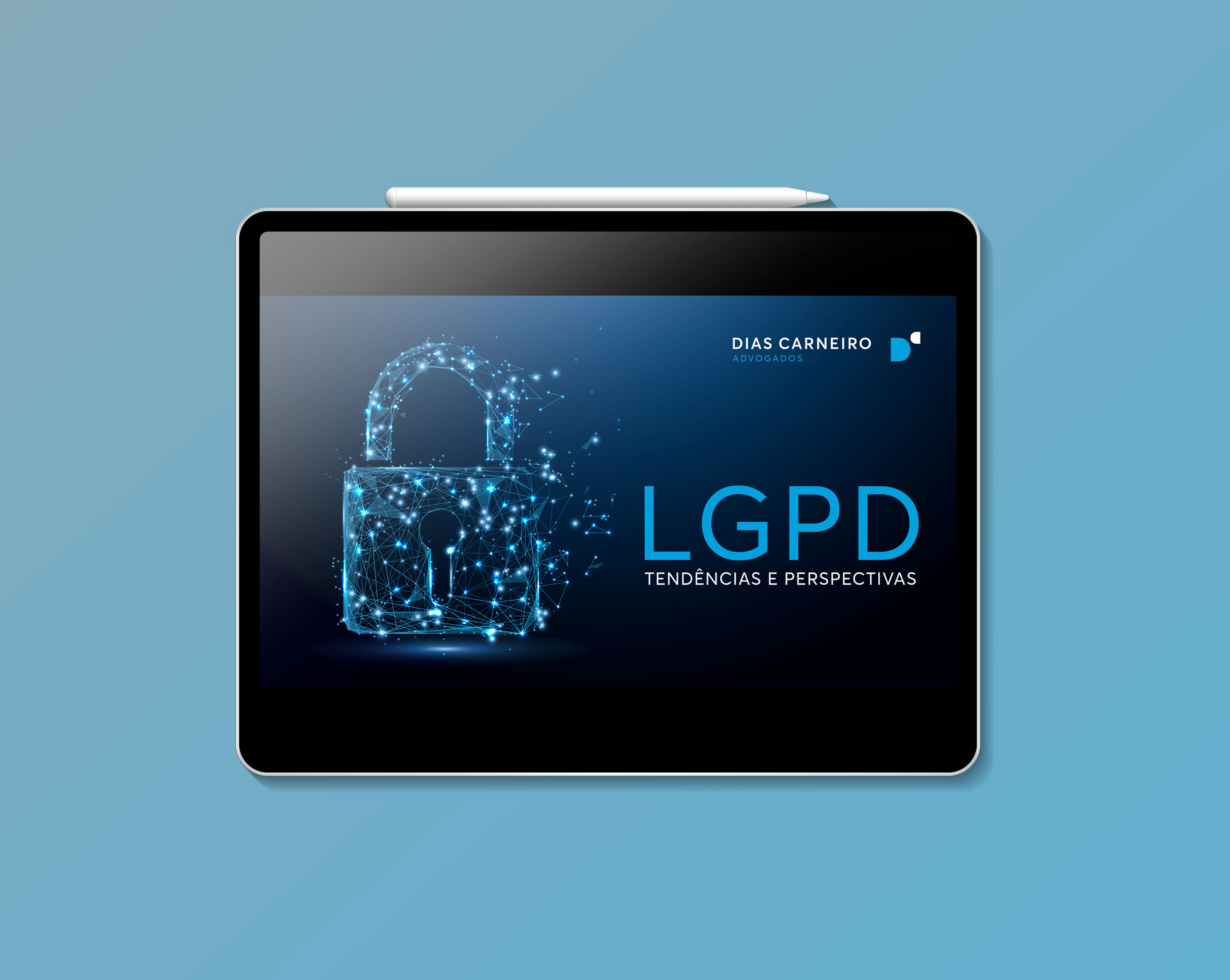
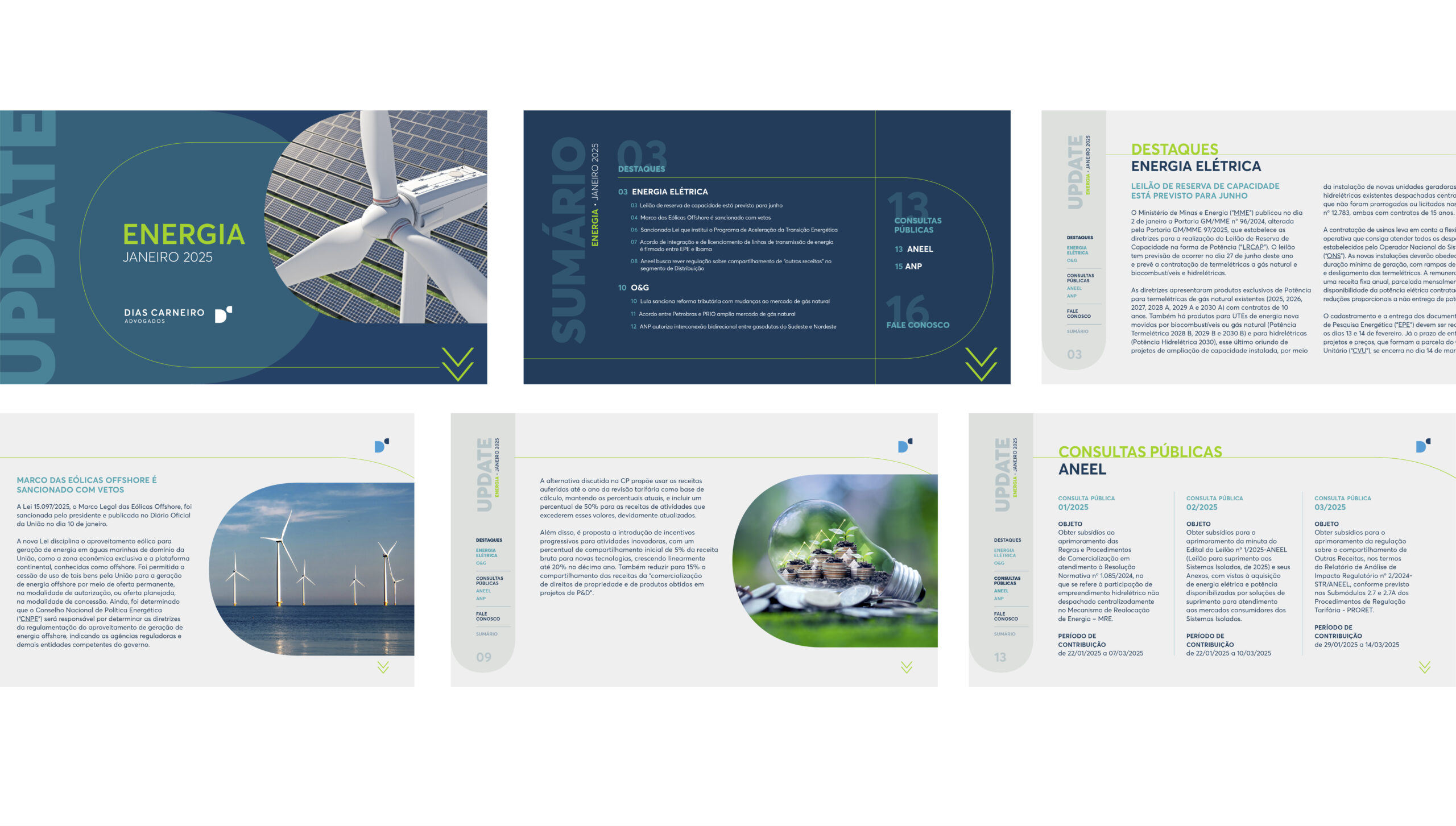
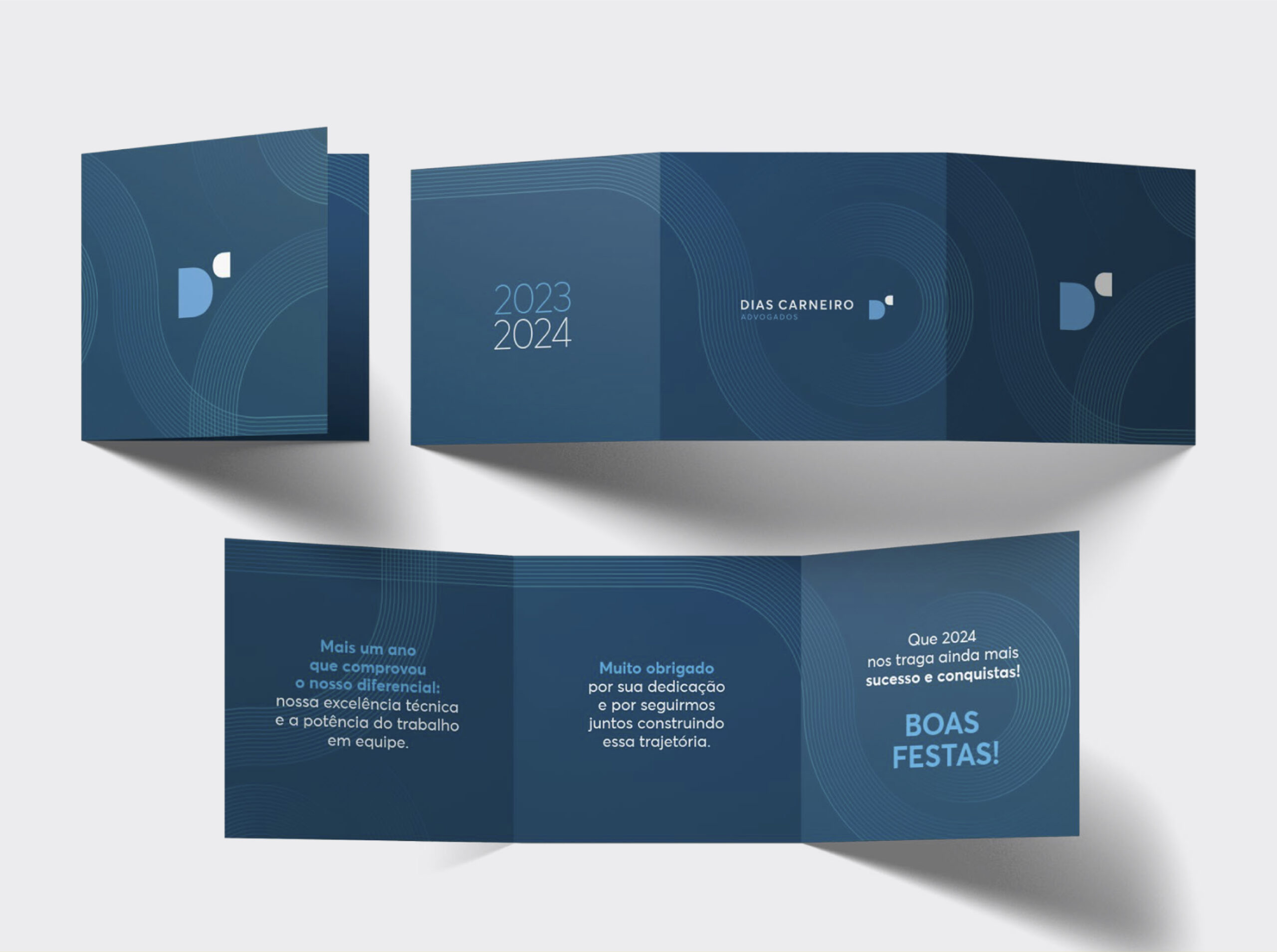
The partnership with Dias Carneiro Advogados marked the beginning of a new working model for Naru: monthly and personalized service. We address the various demands of the legal teams, from creating institutional presentations and publications to developing event invitations and social media graphics.
We believe in collaboration as the foundation for success. Therefore, we work in close partnership with the teams at Dias Carneiro Advogados, ensuring that each project reflects the identity and goals of the firm.
This collaboration exemplifies co-creation with diverse teams within the environment of Dias Carneiro Advogados, a multidisciplinary law firm, reflecting our commitment to providing personalized solutions and exceptional results.
CLIENT: Dias Carneiro Advogados | YEAR: 2023 – 2025
Monthly Service | Graphic Design | Institutional Presentations | Social Media | Promotional Materials


To celebrate the 60th anniversary of Atacadão, the largest wholesale retailer in Brazil, we were hired to create the visual identity for a special project that involved a documentary and a commemorative book. The documentary was made by screenwriter and film director Livia Maria Cappellari from Dz6, and the book featured texts from Prima Pagina.
We believe in co-creation as the foundation for achieving a great project. Therefore, we worked in close partnership with the video and text teams, participating in brainstorming sessions, alignment meetings, and following each step of the process. Through conversations and idea exchanges, we created a project that tells the story of Atacadão in a creative way, divided into movement axes. The project title emerged: *Atacadão 60 Years, Helping to Move Brazil.*
Naru had the opportunity to dive into the audiovisual universe, participating in the process from conception to the finalization of the documentary, creating animations, bumpers, and other graphic elements that enriched the narrative.
For the book, we created a graphic design project that intertwined the two perspectives, using visual elements that connected the movement axes of the documentary to the chronological narrative of the book.
CLIENT: Atacadão | YEAR: 2023
Visual Identity | Art Direction | Photography Direction | Graphic Design | Layout

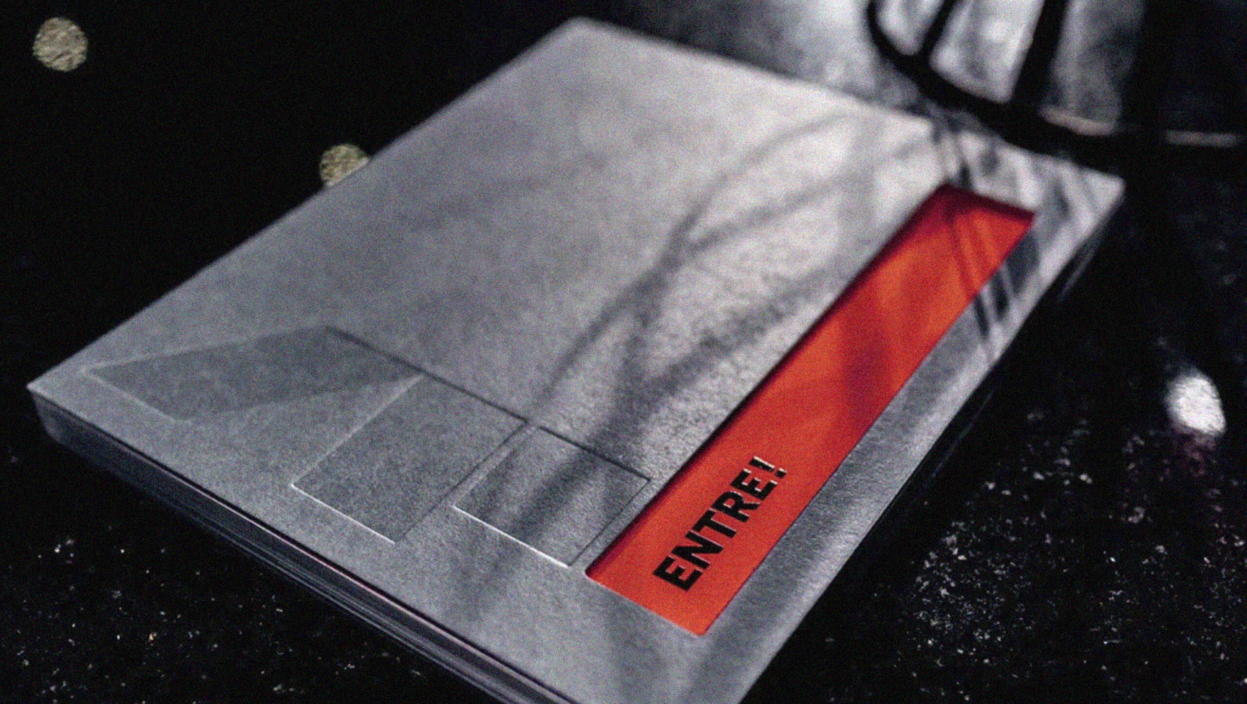
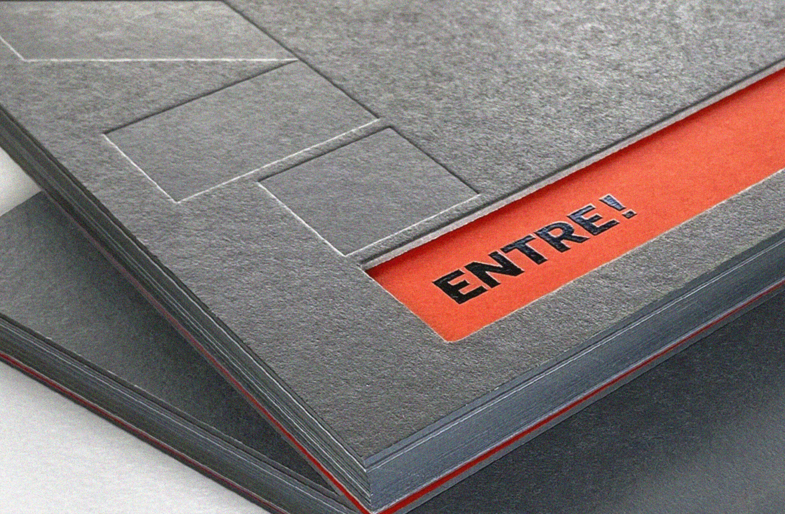
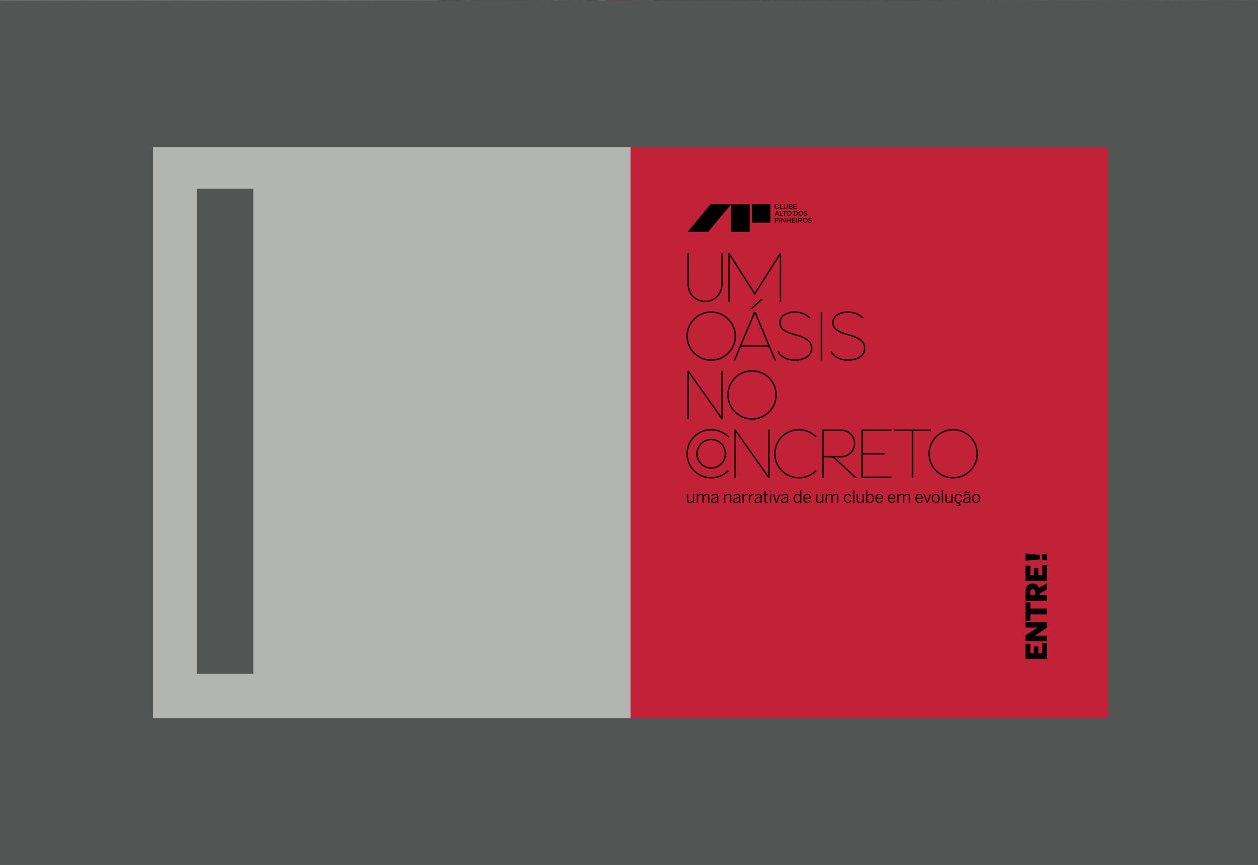
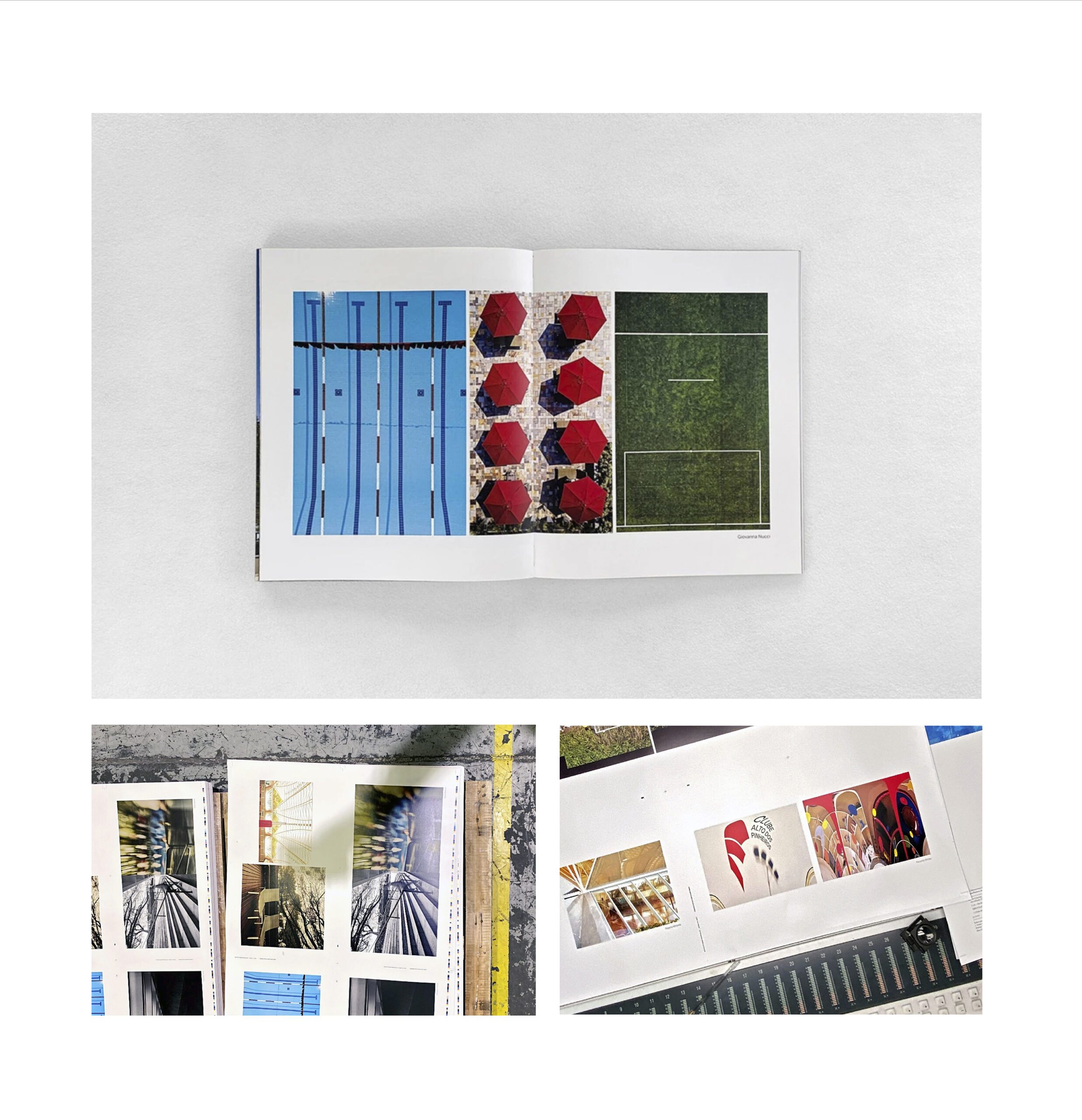
We were hired to develop the graphic design for the 60th anniversary book of the Clube Alto dos Pinheiros, in São Paulo. To do this, we participated in meetings with board members and associates, where we could understand the importance of the club’s architecture and the significance of its historical value. The rebranding of the logo and its new positioning, with the slogan “decidedly off,” helped establish the initial guidelines for the project.
However, it was during a visit to the club that the central idea for the visual concept emerged. The entrance, austere and minimalist, made of concrete, imposes the strength of brutalist architecture. However, once you pass through it, the environment completely transforms: a spacious, green, and welcoming space. This synesthetic experience—the transition from the rigidity of the structure to the fluidity and organic nature of the internal space—served as the inspiration for the entire visual identity of the project.
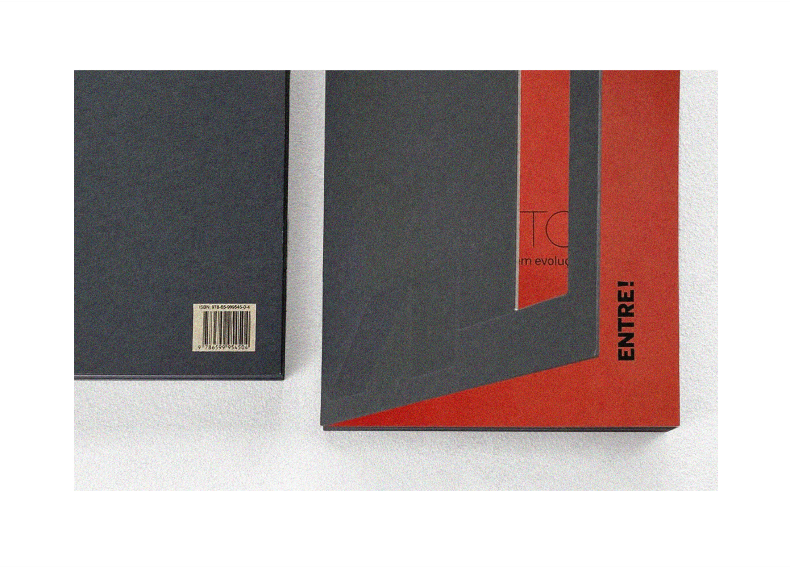
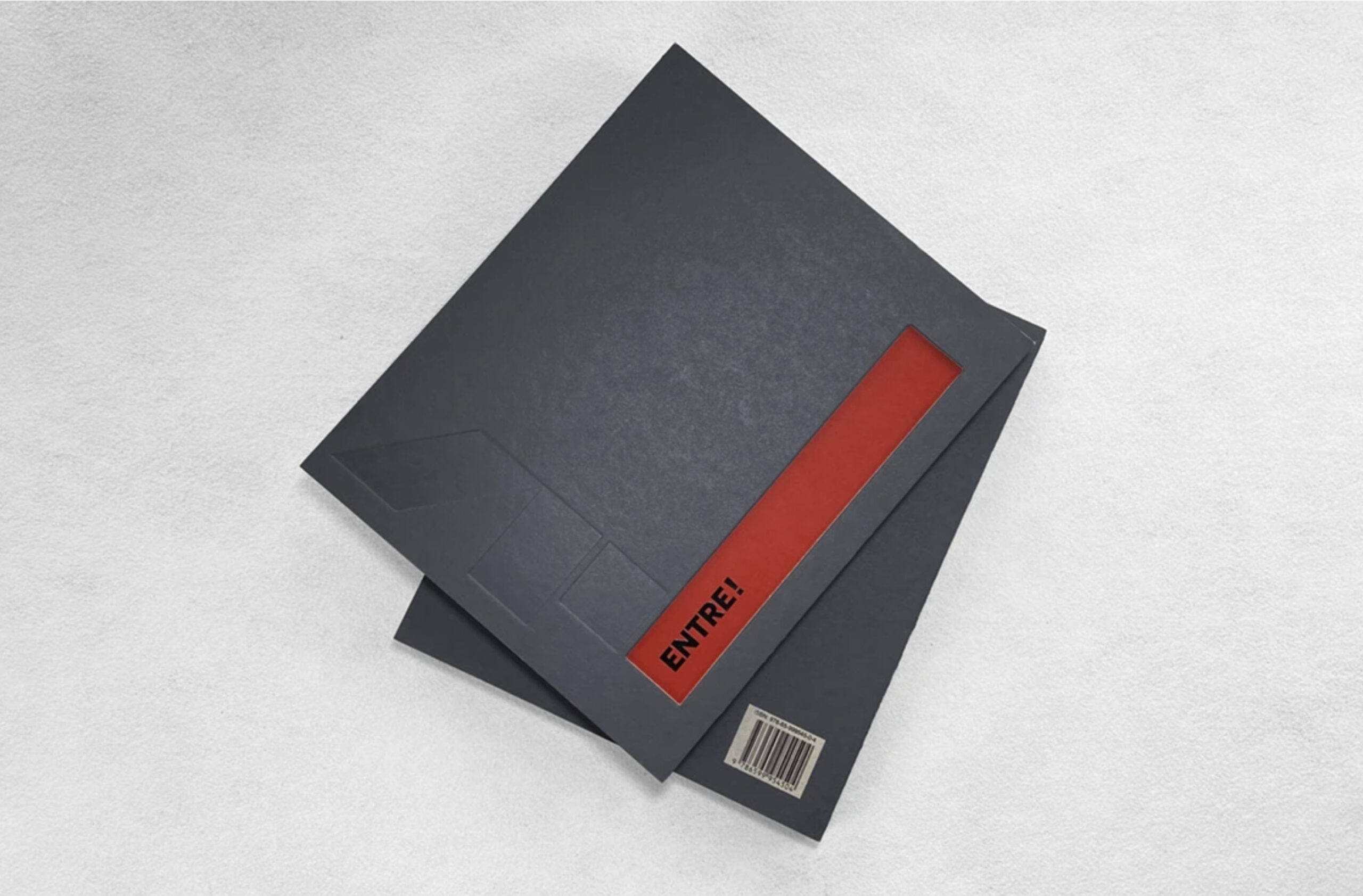
The cover of the book reflects this sensation: made of gray cardboard, reminiscent of concrete, it features a cutout that invites the reader to enter, symbolizing this striking transition between the solidity of brutalist architecture and the lightness of the interior space.
With exquisite graphic production by Estúdio Miolo, texts by Prima Pagina, and the generosity of the associates in sharing their memories, the book became an example of how co-creation can lead to surprising results.
CLIENT: Clube Alto dos Pinheiros | YEAR: 2020
Graphic Design

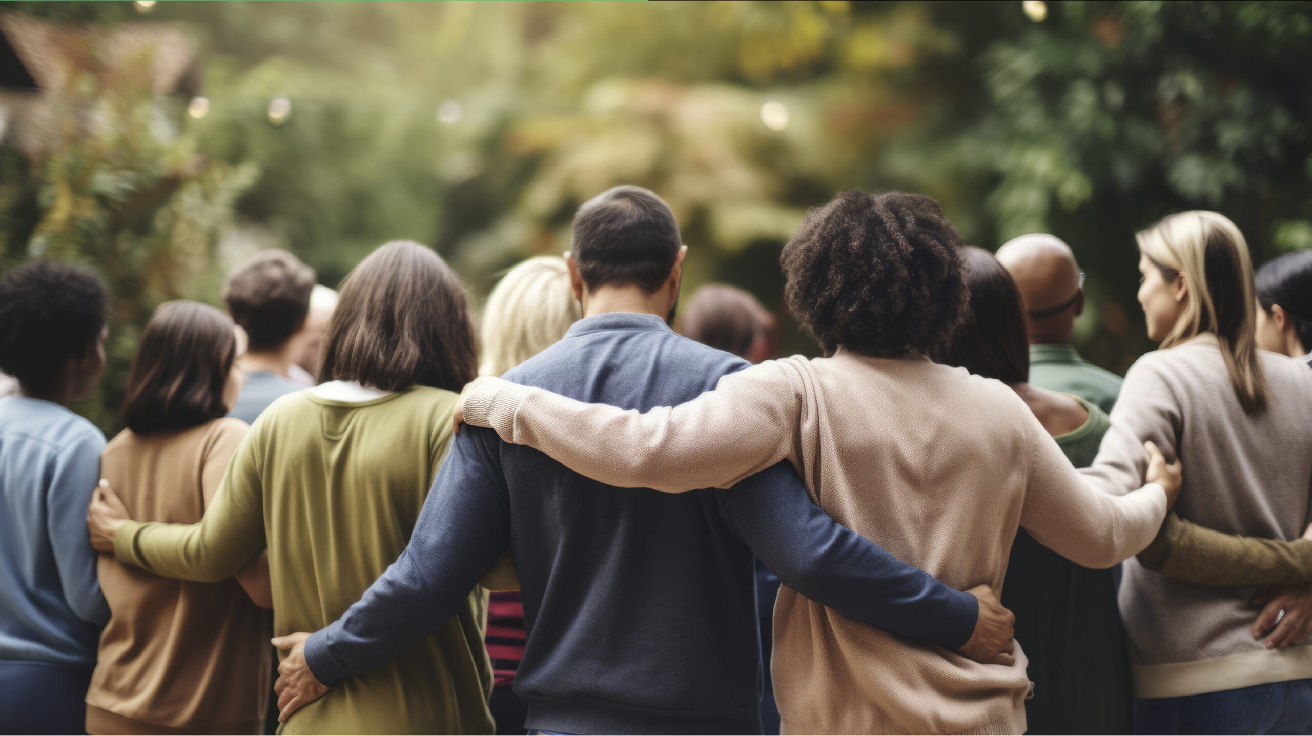
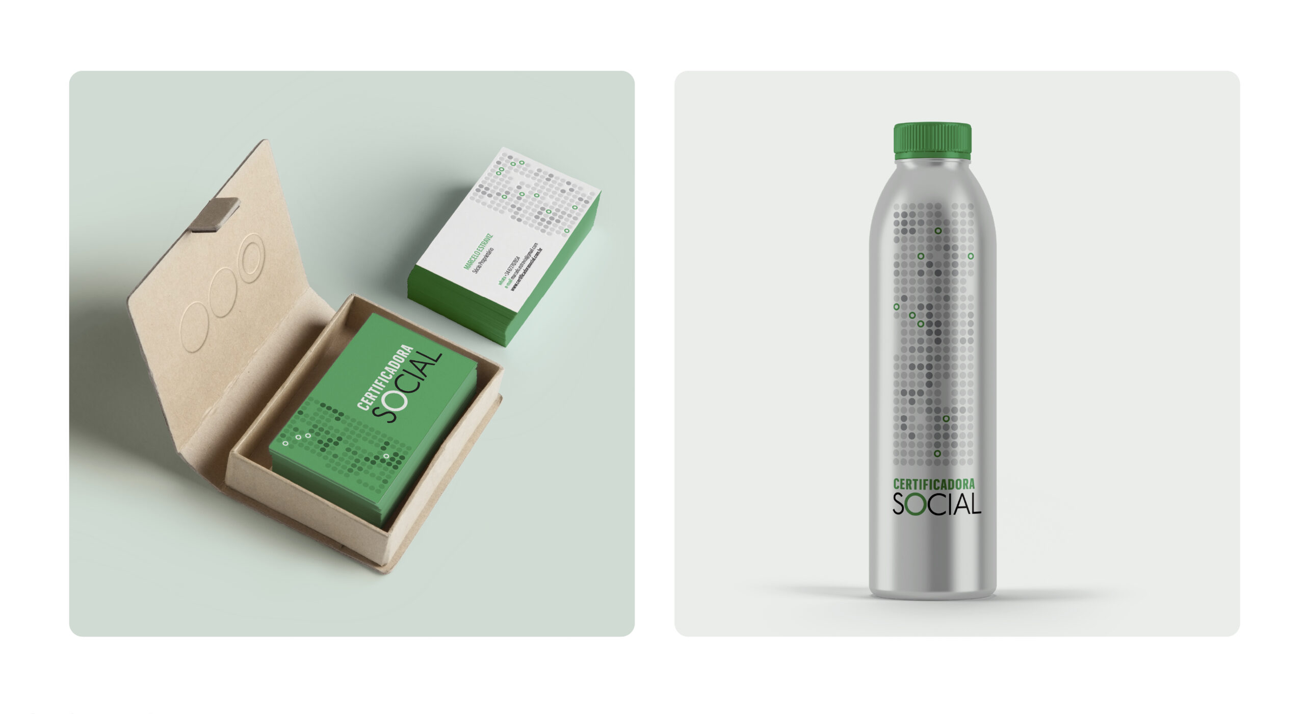
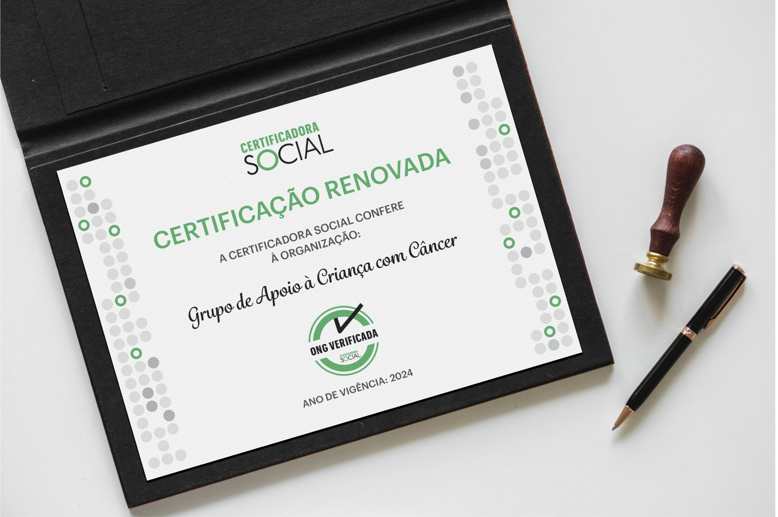
The long partnership with Instituto Doar provided us the opportunity to create the visual identity for Certificadora Social, a project of great relevance to the sector. Instituto Doar transformed into Certificadora Social, and the challenge was to maintain the already consolidated identity of Instituto Doar while creating a new visual identity for Certificadora Social that carried the credibility and trust earned by the Institute.
We worked closely with the creative partners of Instituto Doar, Marcelo Estraviz and Fábio Kanashiro, participating in brainstorming meetings and following each step of the process. Through conversations and idea exchanges, we created a project that reflects the values and objectives of Certificadora Social.
Next, we created the seals for the various certifications available, using visual elements that are related to the visual identity of Certificadora Social and convey the values of each certification.
CLIENT: Certificadora Social | YEAR: 2024
Branding | Visual Identity | Institutional Identity

Marcelo Estraviz


To celebrate Panco’s 70th anniversary, it was essential to explore its origins, incorporating elements that reflect its evolution. From the inspiring beginning of Mr. Franklin, through artisanal production, to becoming a family business with strong values.
The new Visual Identity is based on three pillars:
CLIENT: Panco | YEAR: 2022
Visual Identity | Promotional Material | Event Signage | Giveaways | Packaging