EfexHub
FFX • 2021
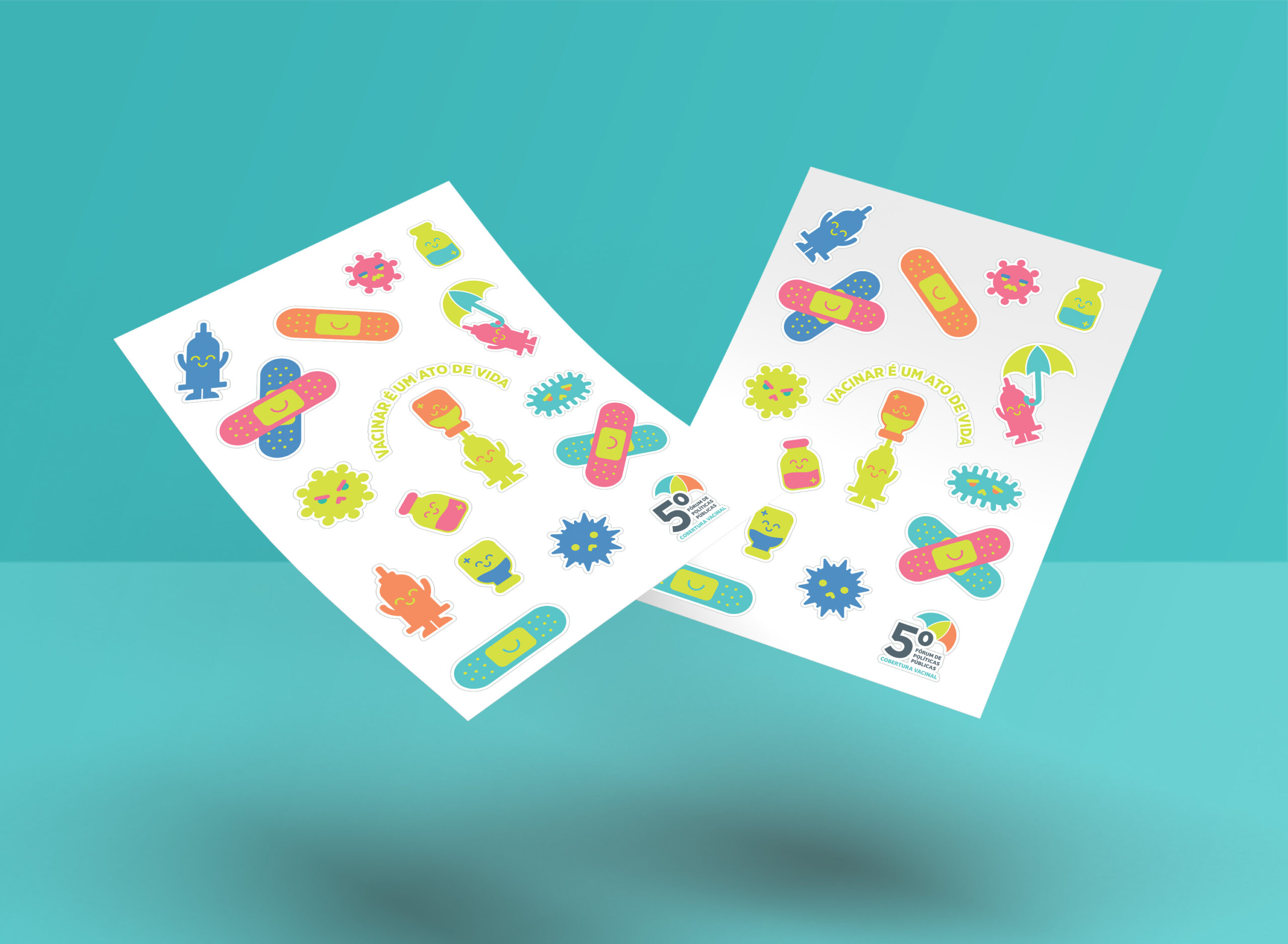
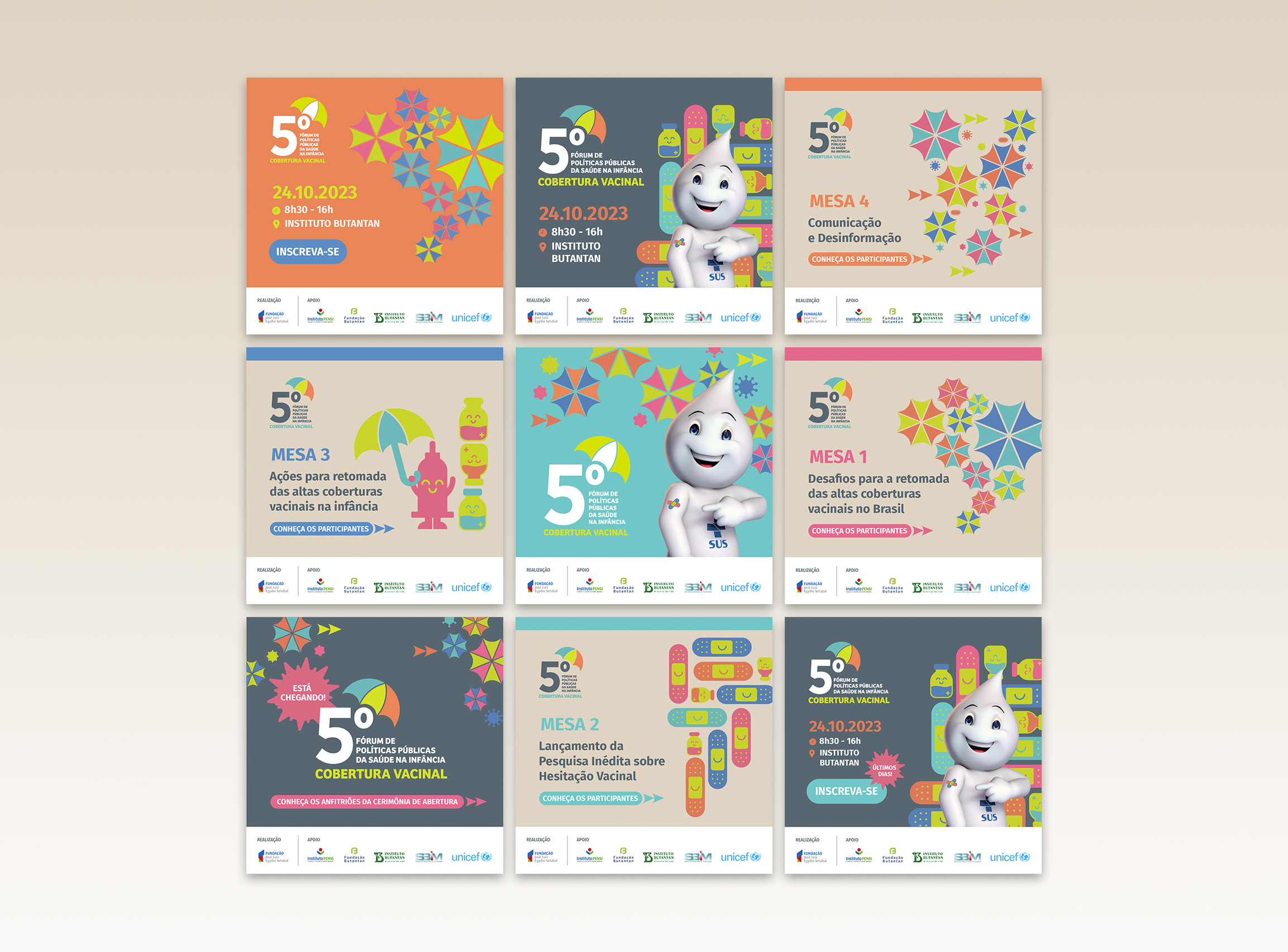
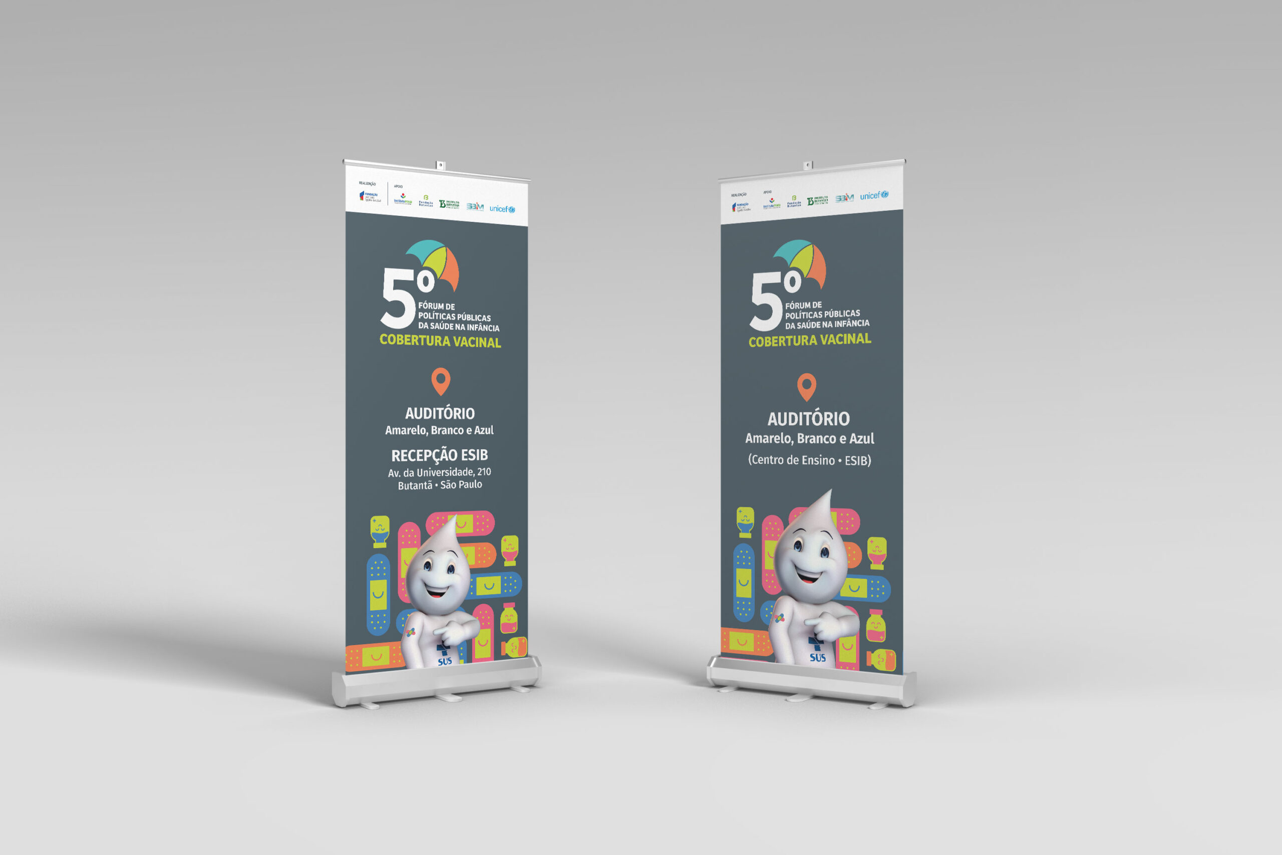
5th Public Health Policies Forum for Childhood
José Luiz Egydio Setúbal Foundation • 2023

4º Fórum de Políticas Públicas da Saúde na Infância
José Luiz Egydio Setúbal Foundation • 2022
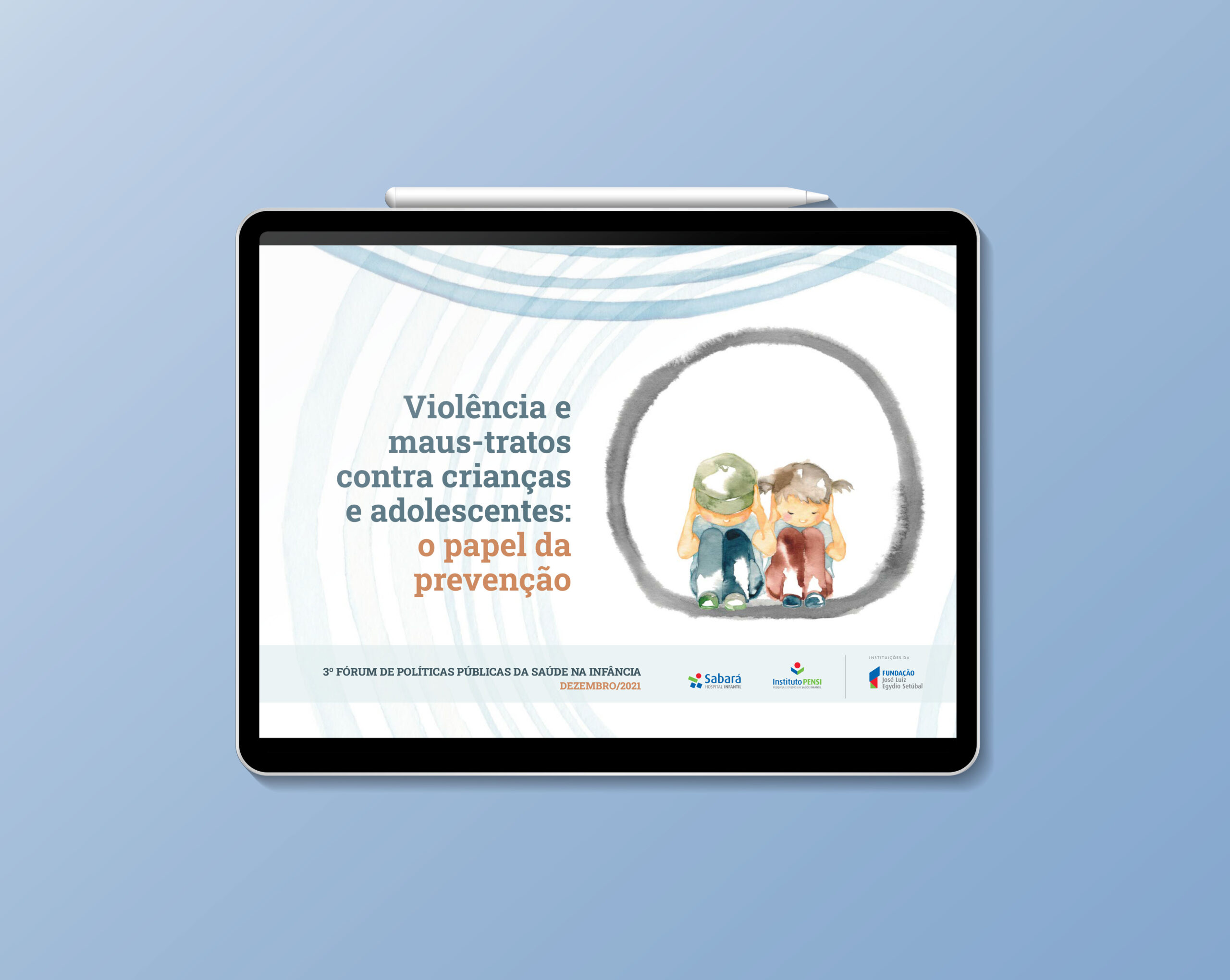
3rd Public Health Policies Forum for Childhood
José Luiz Egydio Setúbal Foundation • 2021
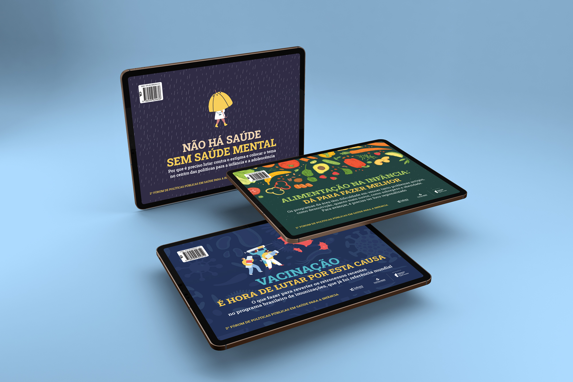
2nd Public Health Policies Forum for Childhood
José Luiz Egydio Setúbal Foundation • 2020
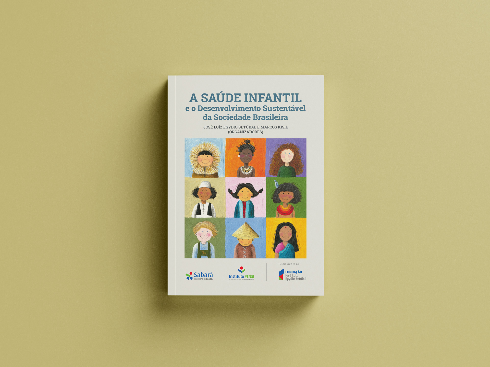
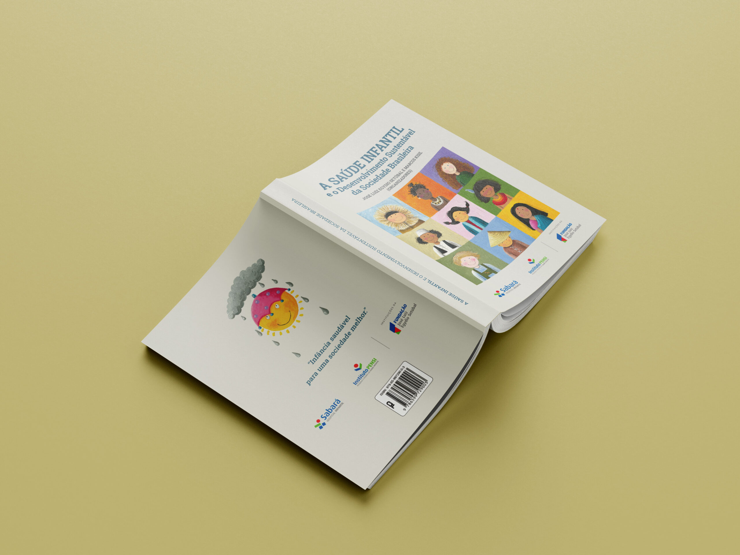
Book A Saúde Infantil
José Luiz Egydio Setúbal Foundation • 2022
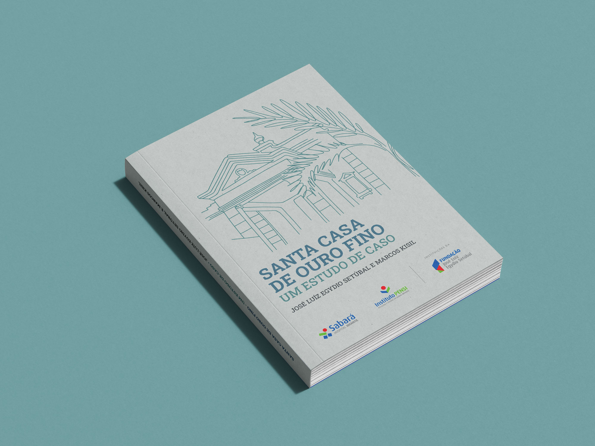
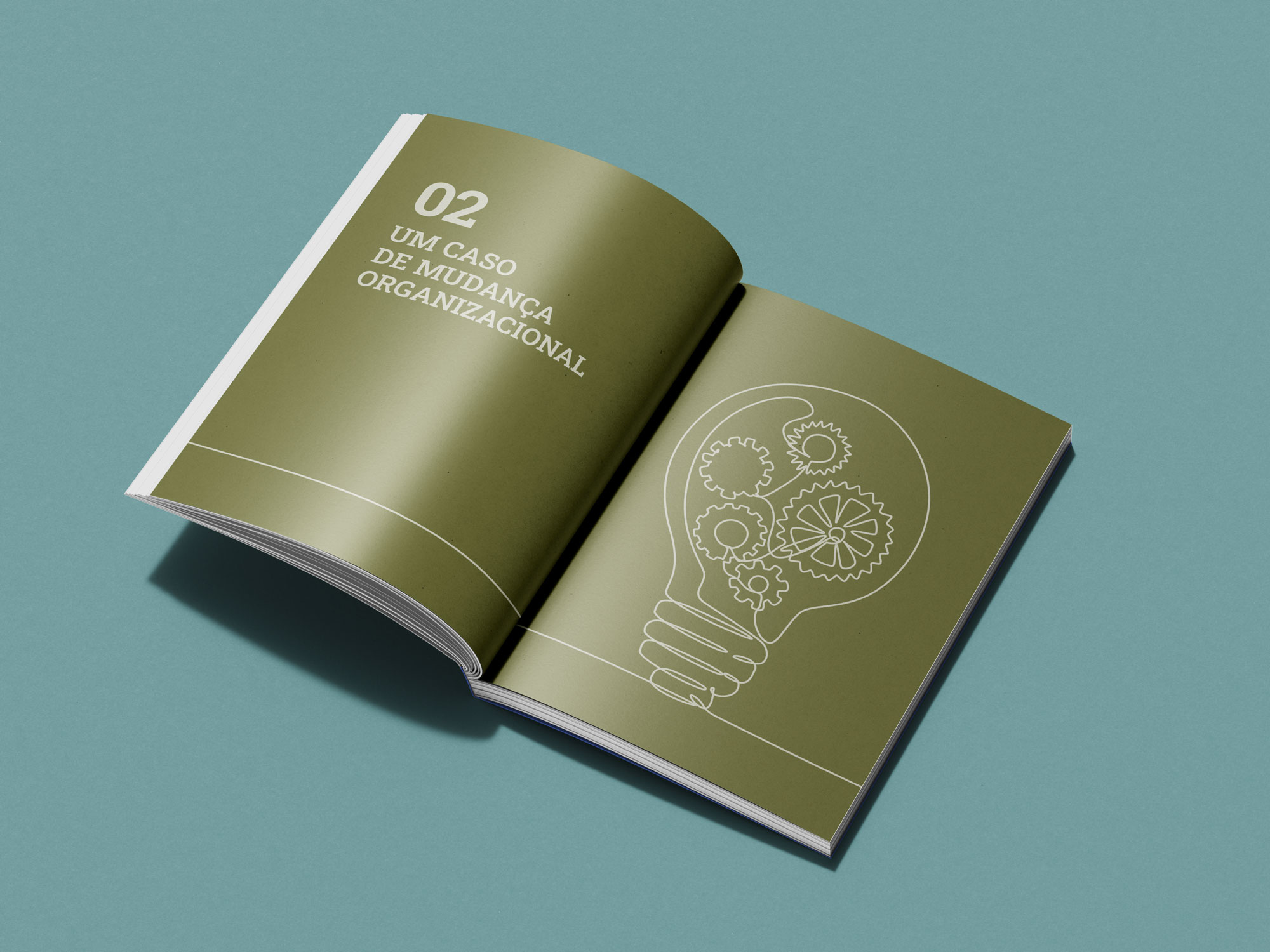
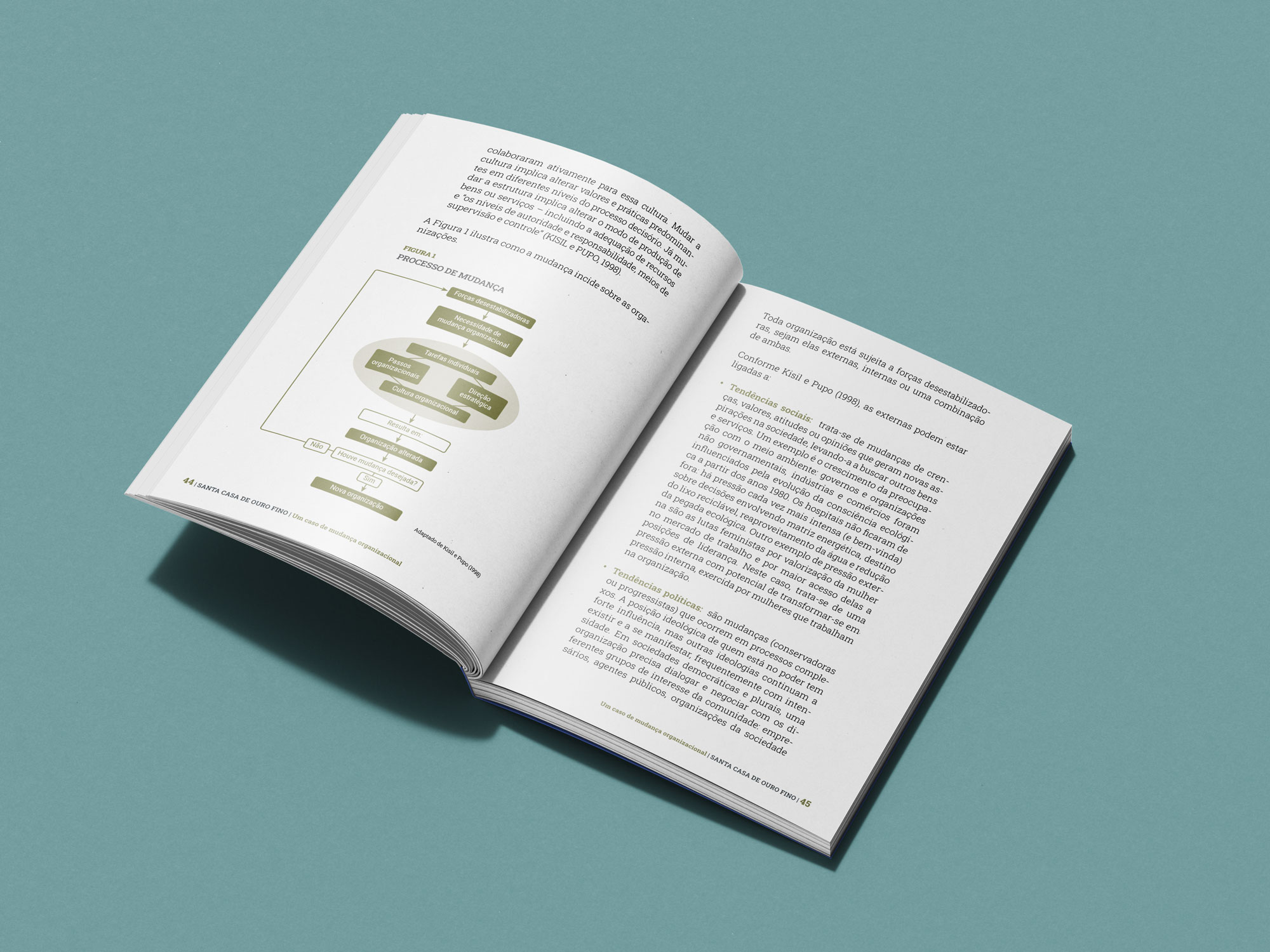
Book Santa Casa de Ouro Fino
José Luiz Egydio Setúbal Foundation • 2022
Tide Setúbal Annual Report 2022
Tide Setúbal • 2022
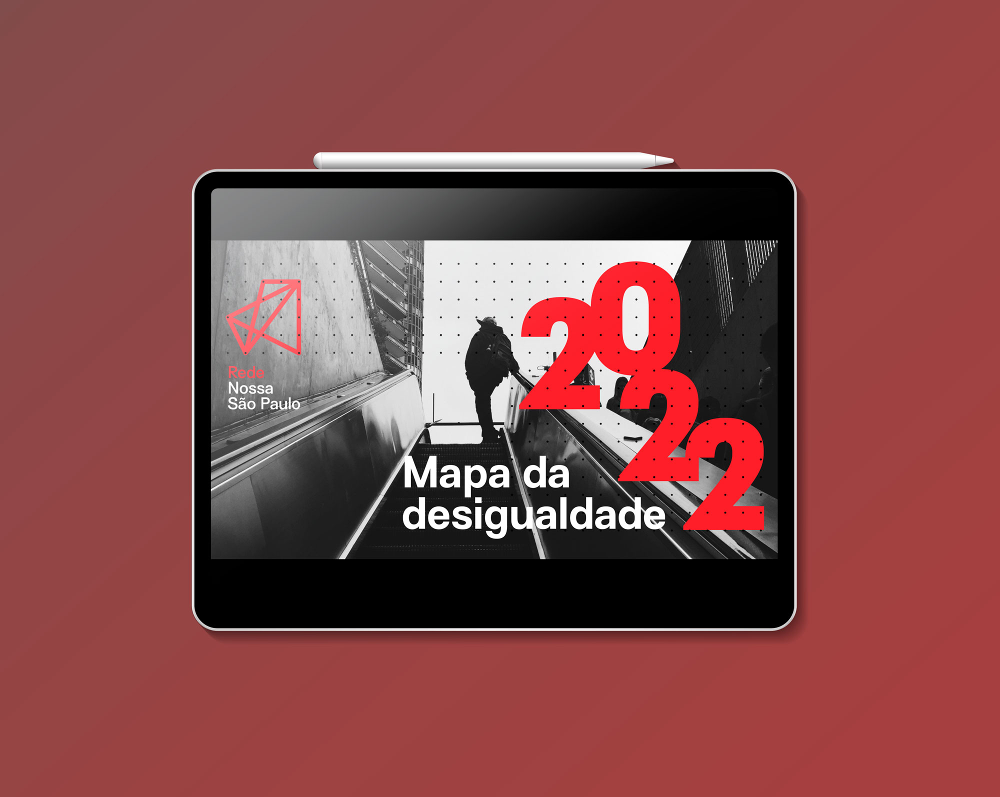
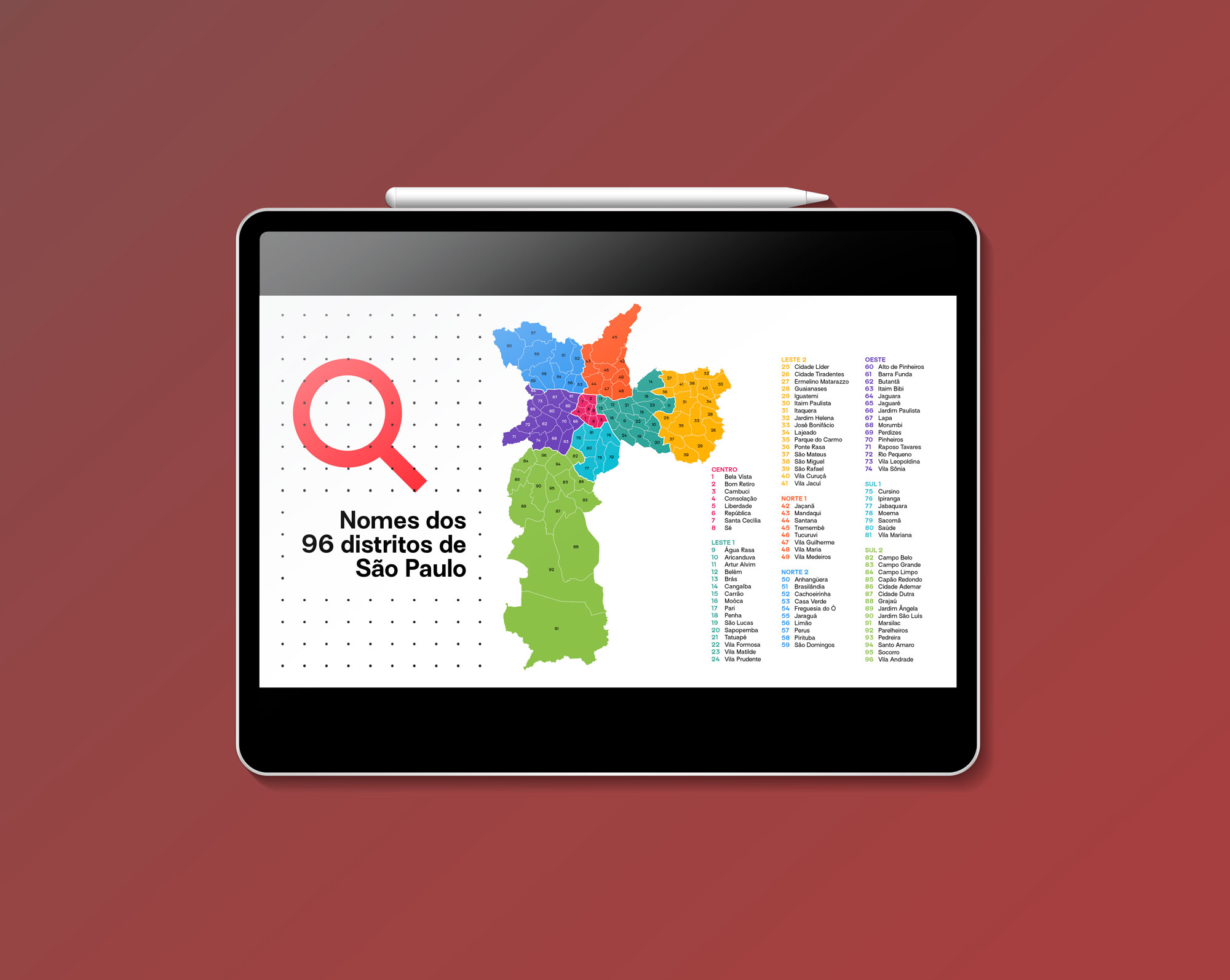
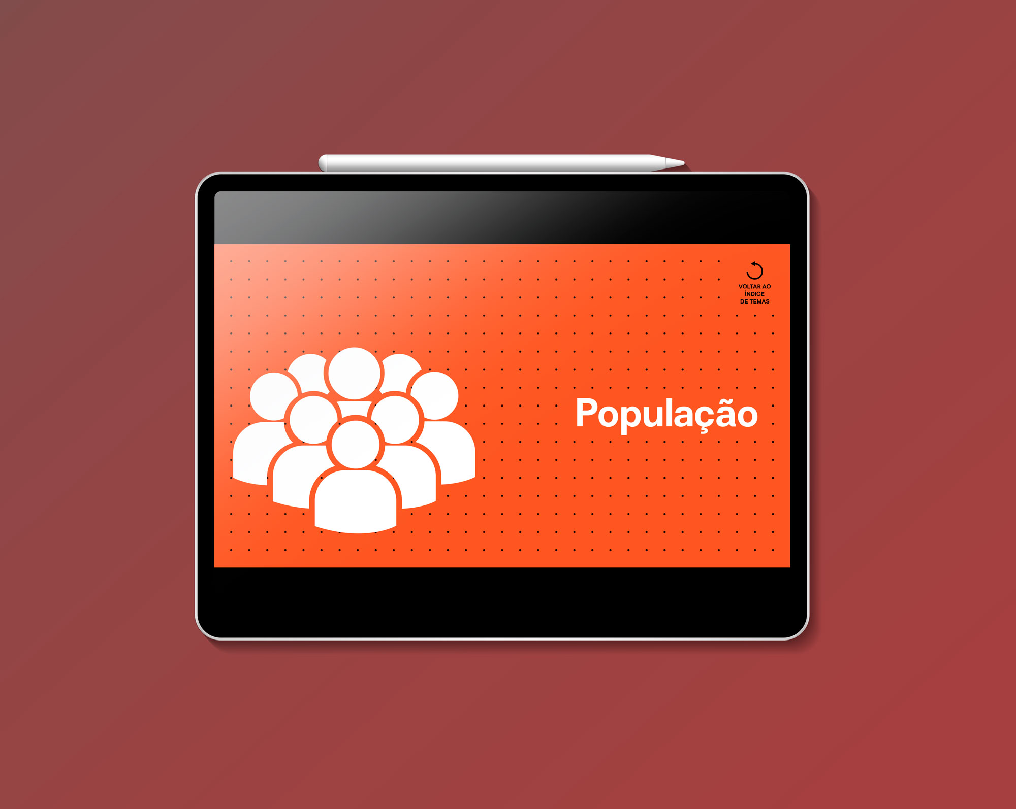
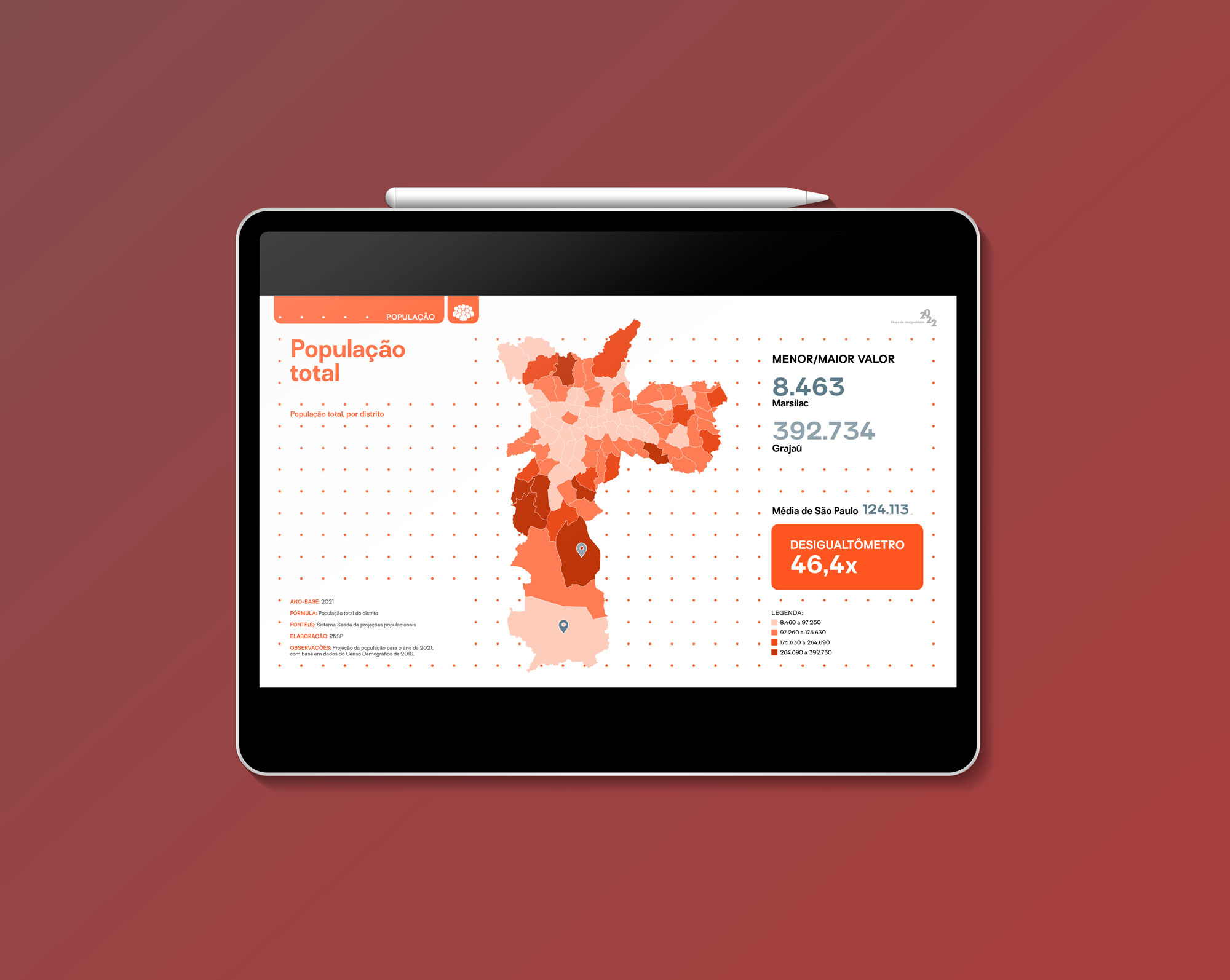
Map of Inequality 2022
Rede Nossa São Paulo • 2022
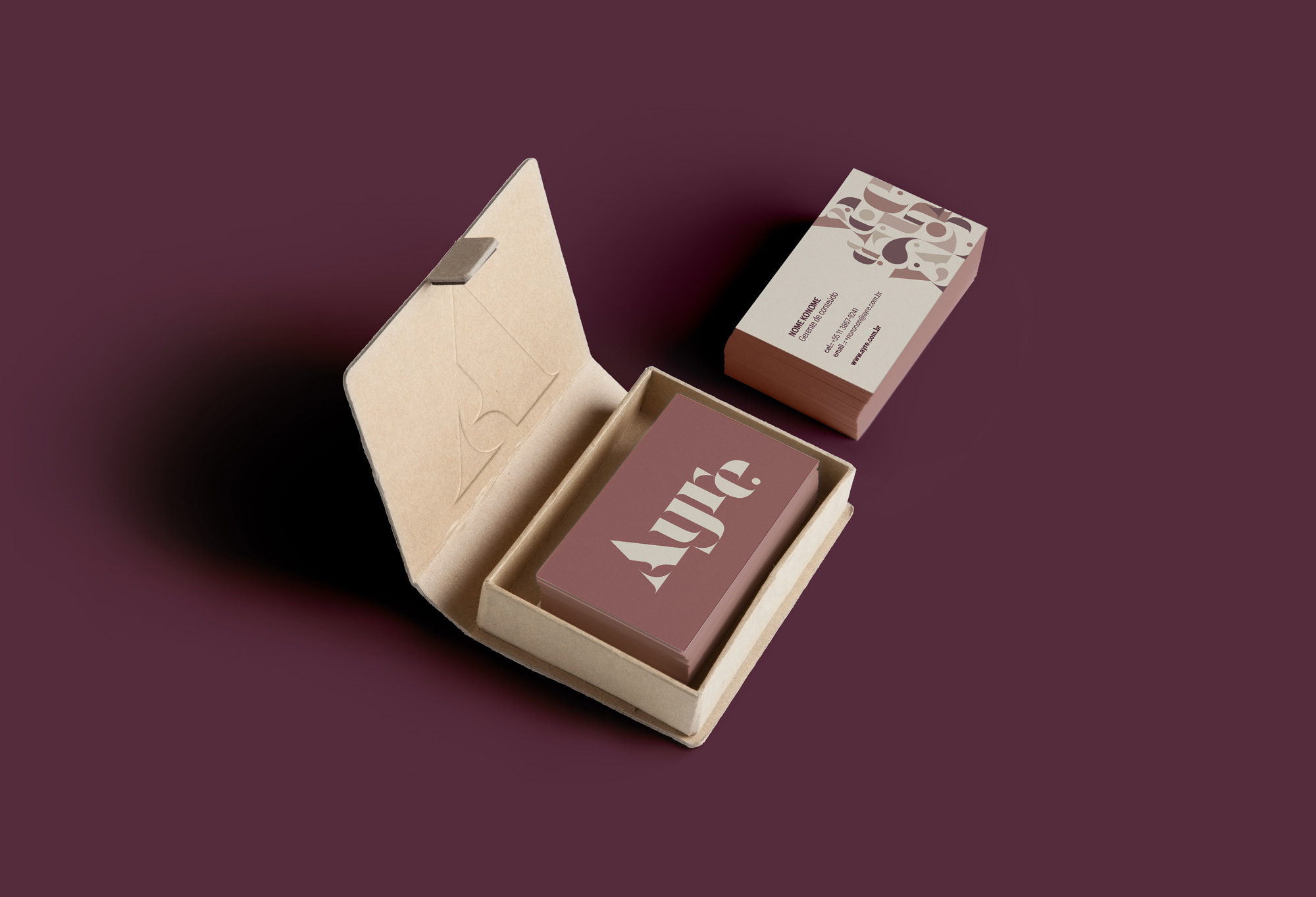
Ayre
Ayre • 2022